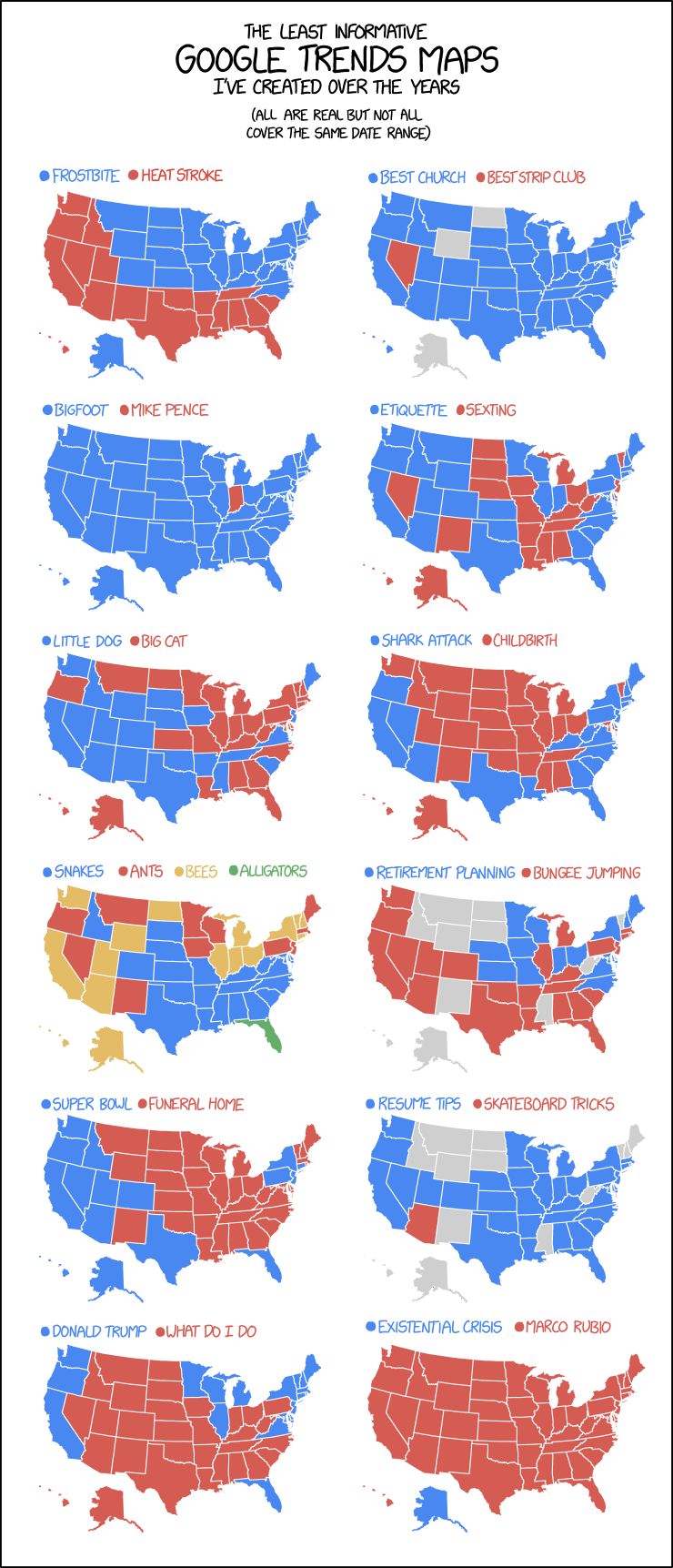
Oh look, another map-themed comic/infographic thingy from xkcd: the March 20 edition is having some fun with the maps generated by Google Trends data. The maps are real, says Randall.
Images
Pop vs. Soda Maps Spoofed by xkcd
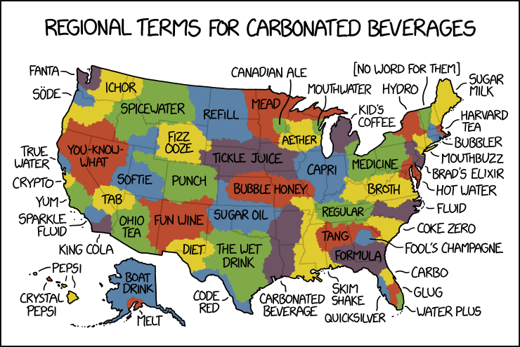
By law, I am required to share every xkcd comic about maps. Today’s makes great fun of pop versus soda maps—the maps showing where in the U.S. carbonated beverages are referred to as pop versus where they’re referred to as soda. Randall takes things to their ludicrous extremes, as he is, by law, required to do.
A Tube Map of Earthsea
Everything under the sun can be expressed as a Tube map. Including, as blogger Camestros Felapton demonstrates above, Ursula K. Le Guin’s Earthsea books. A glance at the original and official maps of Earthsea reveals that world as an intricate, almost overwhelming archipelago: Camestros’s map, like all good transit diagrams, expresses the books as journeys between points.
Blame the Mercator Projection
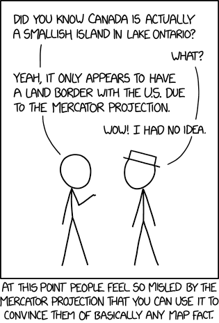
Last Friday’s xkcd suggests that the Mercator projection’s reputation can be used to convince anyone of any false geographical fact.
Not that I’d suggest you do that, mind. No.
Fake Britain: A Map of Fictional Locations

Londonist’s Fake Britain map: “We’ve put together a map of fictional locations from film, TV, literature and other sources. Take a look around this alternative nation and see how many places you recognise. From Judge Dredd to Vanity Fair, it’s all here.
“The vast majority of entries are well defined geographically. Some—such as Beanotown and Blackadder’s Dunny on the Wold—are a little more nebulous, but we’ve added them for fun. Hogwarts is an unmappable location (unless it’s a Marauder’s Map you’re looking at), but we’ve had a go anyway.”
They’re looking for additions and corrections to the map: this is a work in progress. [Scarfolk]
Itchy Feet’s Map of Every American City
Itchy Feet cartoonist Malachi Rempen gives us a sequel to his “Map of Every European City”: the equally true and accurate “Map of Every American City.”
Previously: Itchy Feet’s Map of Every European City.
Itchy Feet’s Map of Every European City

The latest cartoon from Itchy Feet, a comic about travel and language by filmmaker Malachi Rempen, is a “Map of Every European City.” In the comments, the cartoonist says, “Having been to every single European city, I can safely say with confidence that they all look exactly like this.” I don’t think he’s wrong.
ClickHole: 700 Dots on a Map

It’s from 2014, but in the context of dumb viral maps it’s eternally relevant. ClickHole, The Onion’s clickbait parody: We Put 700 Red Dots on a Map.
The dots don’t represent anything in particular, nor is their number and placement indicative of any kind of data. But when you’re looking at them, all spread out on a map of the United States like that—it’s hard not to be a little blown away.
Seven hundred of them. Seven hundred dots. That’s more than 500 dots—well on the way to 1,000. That could represent 700 people, or crime scenes, or cities. Or something that happens in this country every 20 seconds. These dots could potentially be anything—they’re red dots, so they could definitely mean something bad.
Whatever they might be, there’s no unseeing these dots.
Carbon Monoxide from the California Wildfires

Carbon monoxide released into the atmosphere by the California wildfires is drifting across North America in concentrations sufficient to turn up on the Atmospheric Infrared Sounder (AIRS) on NASA’s Aqua satellite. A series of maps showing CO concentrations in the United States between 30 July and 7 August, using AIRS data, have been combined into the animation above.
Previously: Mapping the Northern California Wildfires.
The Changing Padma River

Landsat observations have charted the erosion of the banks of the ever-changing Padma River, a major distributary of the Ganges in Bangladesh. This is vividly shown in this animation produced by NASA Earth Observatory, which “shows 14 false-color images of the Padma river between 1988 and 2018 taken by the Landsat 5 and 8 satellites. All of the images include a combination of shortwave infrared, near infrared, and visible light to highlight differences between land and water.” More on the erosion of the Padma River here.
‘Get a GIS Survey Team in the Air!’
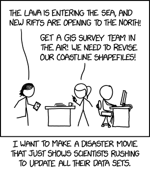
Hey look, GIS people: Randall Munroe made an xkcd comic just for you.
Jug Cerović Maps the Singapore MRT
Jug Cerović’s map of the Singapore MRT is a gem—literally. (Compare with the official version.) [Transit Maps]
Titan in Infrared

Because of its thick and opaque atmosphere, Titan had to be mapped in radar and infrared during a series of close flybys by the Cassini spacecraft. One artifact of this process: the resolution, lighting and atmospheric conditions were not consistent, so mosaic images and maps of Titan’s surface showed visible seams. That’s been corrected in these infrared images of Titan’s surface, released last week. The false-colour images remap infrared wavelengths to the visible spectrum, using a band-ratio technique that minimizes seams. “With the seams now gone, this new collection of images is by far the best representation of how the globe of Titan might appear to the casual observer if it weren’t for the moon’s hazy atmosphere, and it likely will not be superseded for some time to come.”
Previously: Mapping Titan with VIMS.
50 States, One Continuous View
This is a map of the United States without insets. Published in 1975 by the U.S. Geological Survey, it shows Alaska, Hawaii and the lower 48 states in the same, continuous view—though Hawaii’s Leeward Islands are cut off (as are the various territories). Can’t have everything, I guess. It’s available from the USGS as a free downloadable PDF; the paper version costs $9. [MapPorn]
Previously: Alaska’s Cartographic Revenge.
The United States of Canada
We’ve seen maps reimagining the United States reorganized into a different number and configuration of states before, but this map by Reddit user Upvoteanthology_ looks north of the border for inspiration. It imagines what would happen if the U.S. were organized like Canada, with the same population imbalances: Ontario, for example, has 38.9 percent of the Canadian population, so this map imagines a superstate, Shanherria, with 38.9 percent of the U.S. population that spans the entire U.S. South, plus Kentucky, Missouri, Kansas and the non-Chicago parts of Illinois. Meanwhile, Maine is roughly equivalent to Prince Edward Island, and the three northern territories map to Alaska.
Previously: The Concentric States of America; Fifty Equal States Redux.


