After a hiatus of more than two and a half years, Jay Foreman and Mark Cooper-Jones are back to producing new episodes of Map Men. Back in 2016 I called the series “two silly people being very smart about often-silly cartographical situations” (though I may have gotten that backward). Anyway, they’re back, with episodes on the geological origins of the English-Scottish border and trap streets.
Tag: funny
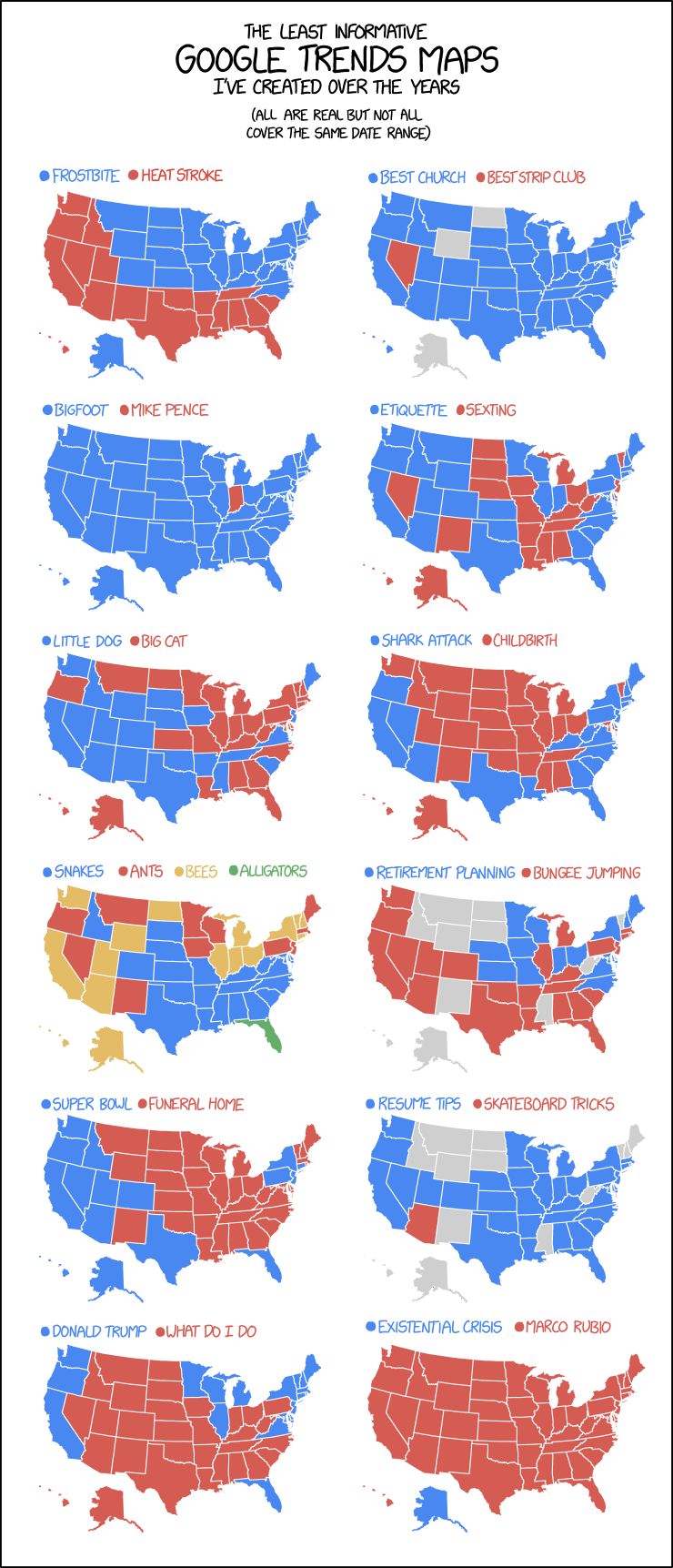
xckd’s ‘Least Informative’ Google Trends Maps
Oh look, another map-themed comic/infographic thingy from xkcd: the March 20 edition is having some fun with the maps generated by Google Trends data. The maps are real, says Randall.
‘Last Week Tonight’ Solves the Missing New Zealand Problem
 On Last Week Tonight’s 17 February episode, host John Oliver took a moment to look at how New Zealand keeps getting left off world maps—the case of IKEA’s map poster being the most recent example. They are nothing if not helpful: as a solution, the show’s Twitter account has posted a cutout map of New Zealand to print and paste on any map that has left it off.
IKEA’s going to need extra security.
New Zealand media is all over this: New Zealand Herald, RNZ, TVNZ.
Previously: IKEA Map Poster Omits New Zealand; New Zealand Launches Campaign to Get Itself Back on World Maps; Maps Without New Zealand.
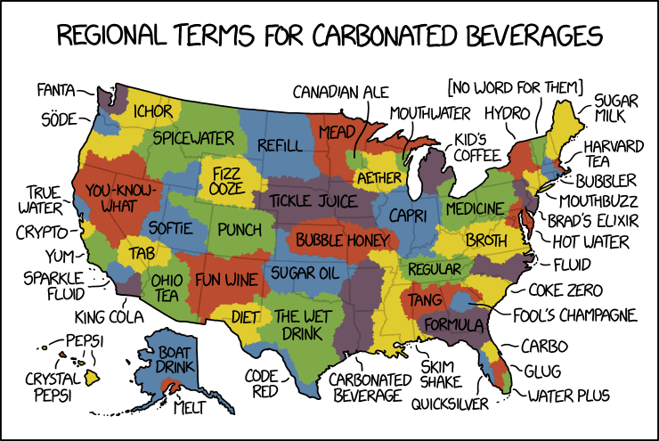
Pop vs. Soda Maps Spoofed by xkcd
By law, I am required to share every xkcd comic about maps. Today’s makes great fun of pop versus soda maps—the maps showing where in the U.S. carbonated beverages are referred to as pop versus where they’re referred to as soda. Randall takes things to their ludicrous extremes, as he is, by law, required to do.
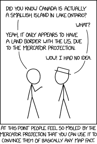
Blame the Mercator Projection
Last Friday’s xkcd suggests that the Mercator projection’s reputation can be used to convince anyone of any false geographical fact.
Not that I’d suggest you do that, mind. No.
Itchy Feet’s Map of Every American City
Itchy Feet cartoonist Malachi Rempen gives us a sequel to his “Map of Every European City”: the equally true and accurate “Map of Every American City.”
Previously: Itchy Feet’s Map of Every European City.
Itchy Feet’s Map of Every European City

The latest cartoon from Itchy Feet, a comic about travel and language by filmmaker Malachi Rempen, is a “Map of Every European City.” In the comments, the cartoonist says, “Having been to every single European city, I can safely say with confidence that they all look exactly like this.” I don’t think he’s wrong.
The Onion: The Cartographers’ Secret Continent
The Onion: World’s Cartographers Continue Living Secret Life of Luxury on Idyllic, Never Disclosed 8th Continent. “‘Ah, yes—this is the life,’ said topographical researcher Garrett Farthing, chuckling to himself as he delicately put the finishing touches on yet another map showing their current location to be an empty stretch of the Pacific Ocean while being fed grapes by a trained monkey from an ultra-docile species found only on their lush, temperate, 3.5-million-square-mile landmass. […] No non-cartographer should ever sully this place with their uncultured presence.” You just had to blab, Onion. [WMS]
ClickHole: 700 Dots on a Map

It’s from 2014, but in the context of dumb viral maps it’s eternally relevant. ClickHole, The Onion’s clickbait parody: We Put 700 Red Dots on a Map.
The dots don’t represent anything in particular, nor is their number and placement indicative of any kind of data. But when you’re looking at them, all spread out on a map of the United States like that—it’s hard not to be a little blown away.
Seven hundred of them. Seven hundred dots. That’s more than 500 dots—well on the way to 1,000. That could represent 700 people, or crime scenes, or cities. Or something that happens in this country every 20 seconds. These dots could potentially be anything—they’re red dots, so they could definitely mean something bad.
Whatever they might be, there’s no unseeing these dots.
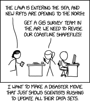
‘Get a GIS Survey Team in the Air!’
Hey look, GIS people: Randall Munroe made an xkcd comic just for you.
Name a Country, Any Country
Last week, Jimmy Kimmel Live had a skit where they asked passersby to name a country, any country, on a map of the world. The results were predictable—doofs who couldn’t name any country at all, or who thought Africa was a country—and so has been the general reaction. Americans not knowing their geography is a cliché that’s decades old at least. Thing is, the half-dozen or so people being shown aren’t a representative sample: the aim here isn’t a scientific survey, it’s good television. And laughing at idiots counts as good TV in America. In that vein, the kid going all Yakko’s World at the end is an absolutely necessary punchline. [Cartophilia]
New Zealand Launches Campaign to Get Itself Back on World Maps
Frustrated by being left off world maps, New Zealand has launched a tongue-in-cheek campaign called #getNZonthemap, the highlight of which is a three-minute video featuring New Zealand prime minister Jacinda Ardern and actor Rhys Darby, who goes full conspiracy theory in the clip. Fun all round. See the video on Facebook or Vimeo.
Previously: Maps Without New Zealand.
Alaska’s Cartographic Revenge
If Shetland gets relegated to inset maps all the time, that goes double for Alaska, which on maps of the United States gets reduced in scale too. In response, this map turns the tables by relegating the lower 48 (as well as Hawaii) to a tiny and crude inset map. The 17×25-inch paper map costs $15. [Maps on the Web]
New Orleans: ‘Totally Unrealistic’ Fantasy City
Holy cow—if you like fantasy maps, spend some time looking at New Orleans. WHAT IS EVEN GOING ON WITH THIS CITY?! If this came in from a freelancer, there are half a dozen things that would raise my eyebrows. pic.twitter.com/ApqYYWlE8d
— James L. Sutter (@jameslsutter) March 19, 2018
Don’t miss writer and game designer James L. Sutter critiquing New Orleans as though it was a city from a fantasy novel. A major criticism of fantasy maps, whether of cities or worlds, is their lack of realism: unrealistic rivers, mountains and so forth. New Orleans, with its totally unrealistic terrain, doesn’t pass the test. “Please clean up your map and resubmit when it follows the rules of a real-world city,” Sutter concludes.
Clickhole: Rising Sea Levels to Turn Australia into a Rhombus

Clickhole, The Onion’s satirical clickbait website, had a hilarious piece last October declaring that rising sea levels will turn Australia into a rhombus: good news for cartographers, for whom Australia will be easier to draw.
According to a new study by the National Ocean Service, melting icecaps and glaciers will raise sea levels enough to cause drastic coastal erosion to virtually every landmass on the planet, including Australia, which will transform from its current shapeless continental configuration into a crisp, tightly angled quadrilateral. While this will unquestionably result in an incalculable amount of economic and ecological devastation, it will likely be a welcome change for cartographers, who instead of spending hours trying to perfect the jagged and asymmetrical outline of the Australian coast like they do now, will in the coming decades be able to handily dash off a geographically accurate rendering of the continent in just a few seconds flat.
In your face, Wyoming. [Cartophilia]


