A rare Braille globe held by the Queensland State Library is being digitized so as to create a 3D-printed replica. The globe, invented by Richard Frank Tunley in the 1950s, is one of the last copies still in existence and is in poor physical shape—problematic for something designed to be touched. That’s where the replica comes in. It’s funded by the library foundation’s crowdfunding initiative, which will also help fund the original globe’s restoration. ABC News, Sydney Morning Herald. Media release. [ANZMapS]
Category: Unusual Maps
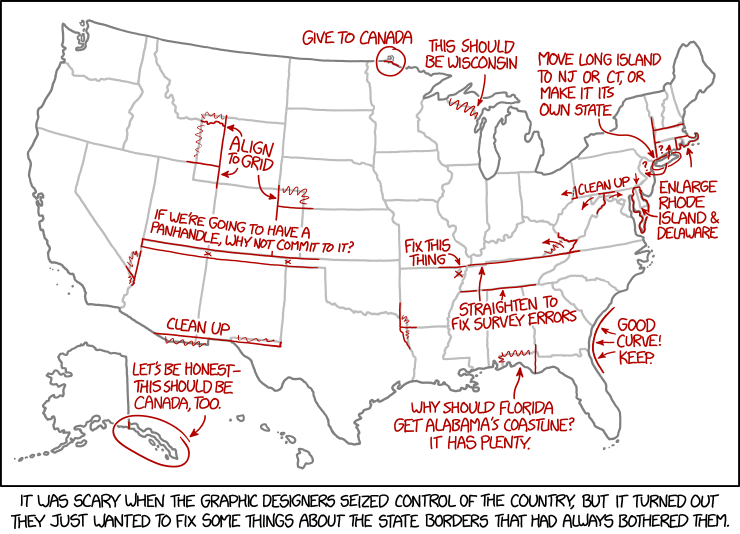
‘They Just Wanted to Fix Some Things About the State Borders’

Today’s xkcd. Apparently, the graphic-designer dictatorship will, in their zeal to fix the state borders, overlook Point Roberts.
Mapping with Microsoft Paint
The Washington State Department of Transportation is clearly run by sadists. They held a contest to create a map of road closures and special events in the Seattle area over the busy 29 September to 1 October weekend. But because they’re sadists (or because it’s Washington State, home of Microsoft), the map had to be created using Microsoft Paint, with entrants drawing on a supplied base layer.
In the end, there were four entries, which can be viewed at this Flickr album. Voting is by likes on Flickr or via Twitter. [Sarah Bell]
Guatemala’s Giant Relief Map

Atlas Obscura has the story of Guatemala’s Mapa en Relieve, an exaggerated-relief 3D relief model of the country. The 1:10,000-scale horizontal, 1:2,000-scale vertical map is approximately 1,800 square metres in area and made of concrete. Built by Francisco Vela and put on display in 1905, the map includes present-day Belize as part of Guatemala, which claimed the British Honduras at that time. It kind of reminds me of British Columbia’s Challenger Map, only a half-century older and made of concrete rather than wood. [WMS]
Ordnance Survey Map Cake
This cake in the form of an Ordnance Survey map is the creation of Scottish cake decorator World of Cake; it marks “a spot where the birthday hiker apparently got quite lost!” Now the rest of us will want one. [Ordnance Survey]
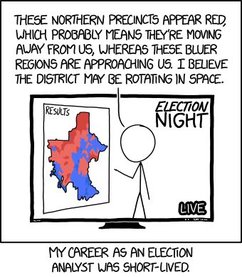
xkcd’s Relativistic Election Maps

I’m surprised it took as look as it did for physics and cartography to collide—relativity and choropleth maps—in an xkcd cartoon.
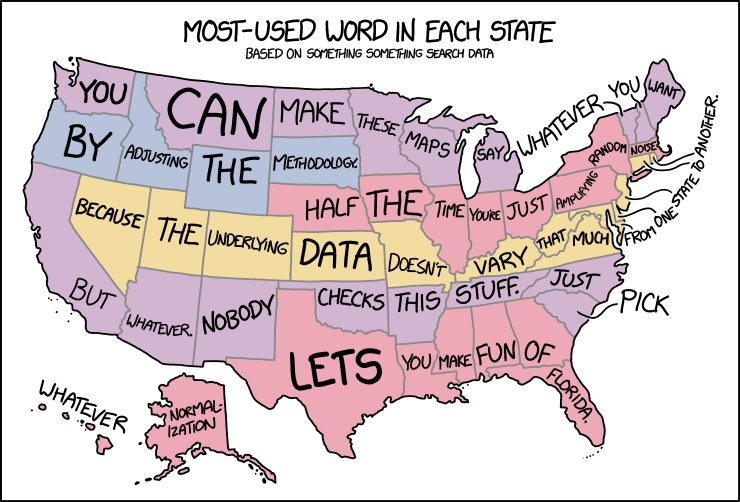
‘Based on Something Something Search Data’

In yesterday’s xkcd cartoon, Randall makes explicit what I think a lot of us have been thinking about those maps assigning a word or a search term to each state or country or whatnot.
Post-Brexit EU Map Shows Independent Scotland

A new post-Brexit map of the European Union shows Scotland as an EU member separate and independent from a rump “United Kingdom of England, Wales and Northern Ireland,” which is coloured like other non-EU members. Commissioned by Interkart and produced by XYZ Maps, the 119 × 84 cm wall map costs £24/40€. Interkart, XYZ Maps. [WMS]
A Giant Map for Presidential Inauguration Planning
The U.S. military uses a huge floor map of Washington, D.C. to plan for presidential inaugurations, as the Tech Insider video above shows. According to this, it’s used by the Armed Forces Inaugural Committee, a joint-service organization that provides military ceremonial support. (See this U.S. Army article from 2012 about the 2013 inauguration, and this 2008 Pruned blog post about the 2009 inauguration.) [Tim Wallace]
End of the Line: A Tube Map of Tube Maps
Well, this is meta. Kenneth Field, whose map of Mars I told you about earlier this year, has created a tube map of tube maps.
End of the Line is an attempt to be the last word in tube map pastiche. […]
While Beck himself likely ‘copied’ a number of aspects that ended up on his map he did so with consummate skill to create something unique, innovative and functional. Most subsequent schematic maps are pale imitations. We wrote a semi-academic paper about it which you can access from my blog here.
All too often we see transit map templates used as a short-cut to recognition and success. With no hint of irony whatsoever (!) we’ve done exactly the same and mapped the weird and wonderful world of Becksploited maps onto some tube lines and stations.
Becksploitation. There’s a term for you. It’s not like there’s no use for it.
A Magnificently Rude Map
The firm of Strumpshaw, Tincleton & Giggleswick produces whimsical maps of funny place names, including the Magnificently Rude Map of World Place Names, which shows where on the globe there are places with names that mean Naughty Things in English. Because we are 12 years old. [Buzzfeed]
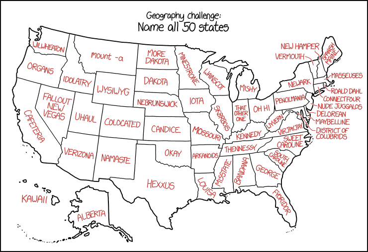
xkcd’s U.S. State Names

Randall is messing with us again in today’s xkcd, which assigns malapropisms and synophones to U.S. state names. The results are about what you’d expect.
Previously: xkcd’s United States Map.
What If Only … Voted?
While we wait for the results, think back, raise a glass, and remember fondly the meme that came and went so quickly a month or so ago: What if only … voted? Based on FiveThirtyEight maps showing the gender gap in voting intentions (What if only women voted? What if only men voted?) that quickly went viral, similar maps showing gap by race and education
Nonstop Metropolis: A New York City Atlas
 Another book coming out this month: Nonstop Metropolis: A New York City Atlas by Rebecca Solnit and Joshua Jelly-Shapiro (University of California Press, 19 October). It’s the third and apparently final book in a series of city atlases authored or co-authored by Solnit — you may remember Infinite City: A San Francisco Atlas (2010) or Unfathomable City: A New Orleans Atlas (2013). If you do, you’ll have some idea of what Nonstop Metropolis is likely to be about. Curbed New York’s Nathan Kensinger has a piece on it, in case you don’t. [MAPS-L]
All the Countries Boris Johnson Has Offended
Boris Johnson is Britain’s new foreign secretary. The Independent’s indy100 news site has put together a map of all the countries BoJo has offended. It’s interactive: at the link, hover over the country to get the oh-god-what-did-he-say-and-did-he-really-use-that-word story.
Related: a map of countries with a buffoon for a foreign secretary.


