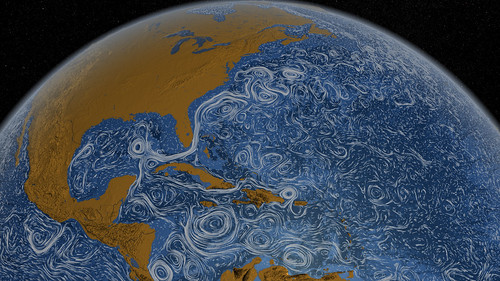
You may have seen this already: a beautiful, painting-like visualization of the world’s surface ocean currents between June 2005 and November 2007, which NASA posted last month. The visualization is based on model data from the ECCO2 project. See also this short video on Flickr (Flash required). Image credit: NASA/
