A short video from Vivid Maps showing the evolution of time zone boundaries in the United States. (The trend was inexorably westward: Michigan started out completely CST.)
Tag: USA
Adventures in Midcycle Redistricting
The U.S. congressional electoral map was redrawn after the 2020 census, but now parts are being redrawn again. ABC News has a page tracking developments in what they call midcycle redistricting. “More than a half-dozen states face the prospect of having to go through the redistricting process again, mostly due to federal and/or state litigation over racial or partisan gerrymandering concerns. Both Democrats and Republicans have the opportunity to flip seats in districts drawn more favorably than they were last cycle. For example, Democrats appear poised to pick up at least one seat in Alabama and could theoretically get more favorable maps in Louisiana and Georgia. Republicans, meanwhile, could benefit from more favorable 2024 maps in North Carolina and New Mexico.”
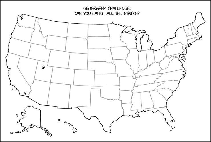
xkcd’s Geography Challenge

Stare at this map for a while until you figure out what Randall Munroe has done in last Friday’s xkcd. Then scream. (Kottke says: “This is evil.”) It’s not the first time that xkcd has committed mischief and violence on an outline map of the contiguous United States: see, for example this one, or this one. I worry it may not be the last.
Previously: xkcd’s United States Map; The Contiguous 41 States—Wait, What?
The Origins of U.S. County Names
Curious about the origins of American place names, Lia Prins built a dataset of U.S. county names and categorized them by what they’re named for and the language they’re named in. There’s an interactive map, detailed inset maps showing how names types are clustered, and a discussion of methodology. [Maps Mania]
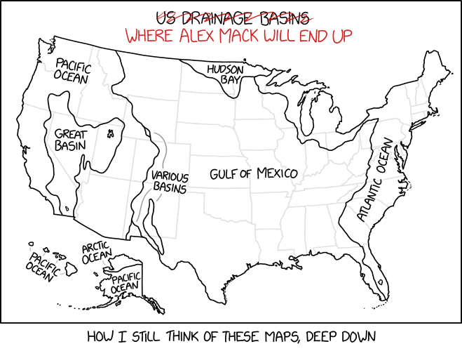
xkcd’s Drainage Basin Deep Cut

This xkcd cartoon requires deep Nickelodeon knowledge to understand.
Mapping Anti-Trans Legislation Risk
There has been an outbreak of anti-trans legislation at the state level in the United States, and Erin Reed has spent the last three years tracking it. Her anti-trans legislative risk map measures the extent to which trans people are endangered by such legislation, whether it’s already on the books or could be the offing before the next election. The map reveals, no surprise, a polarized America: one where some states are racing to put anti-trans laws on the books while others enact protections and set themselves up as safe harbours.
Previously: Mapping Safe Washrooms.
New Book About Emma Hart Willard
 A book about the work of Emma Hart Willard (1787-1870) is coming out this month from Visionary Press. The book, Emma Willard: Maps of History, includes an essay by Susan Schulten (who also edited the book) along with reproductions of Willard’s maps, atlases and time charts (for example, the 1828 set of maps that accompanied her History of the United States, or Republic of America), which proved hugely influential in terms of using maps in pedagogy, as well as historical maps and graphical depictions of time. The book is part of a series, Information Graphic Visionaries, that was the subject of a successful Kickstarter last year. Outside of that crowdfunding campaign, the book can be ordered from the publisher for $95 (it’s on sale right now for $85). [Matthew Edney]
Previously: Emma Willard’s History of the United States; Women in Cartography (Part 3).
Wildfire Aware
Wildfire Aware is an interactive map of wildfires in the United States that lists fires by the number of personnel fighting them. Selecting a fire brings up a lot more information, drawn on 22 layers from Esri’s ArcGIS Living Atlas of the World. [ArcGIS Blog]
The Climate Shift Index

Bloomberg has the story on the Climate Shift Index, which maps the impact of climate change on daily temperatures in the U.S. It doesn’t quite work the way you’d expect at first glance: the index, ranging from -5 to +5, measures the calculated impact of climate change on the current temperatures. This video explains how it works, as does the FAQ.
One Racial Dot Map Closes, Several New Ones Appear
Maps Mania reported last month that the University of Virginia’s Racial Dot Map has been taken offline. The proximate causes: the 2020 census, which rendered the map obsolete (it was based on 2010) data; the increased complexity of the 2020 census’s racial data (more people IDing as multiracial or other); and insufficient resources to bring the map up to date given that complexity. But Maps Mania points to a number of new racial dot maps, such as CNN’s and Ben Schmidt’s All of US, which operate despite the caveats identified by UVa; plus see the following previous posts: Census Mapper: An Interactive Map of U.S. Population Changes; Mapping Racial Population Shifts in the United States.
Mapping Daylight Saving Time
Daylight saving time has been in the news again, with the U.S. Senate voting to make it permanent year-round. So it’s worth looking at maps that explore the impact of standard time and daylight saving time, and time zones in general, on the time of sunrise and sunset. And as far as the United States is concerned, that means looking at some maps by Andy Woodruff, who’s been exploring this question since at least this 2015 blog post. Which was supplanted in 2019 by this so-called gripe assistant tool to help you quantify your whining about the biannual change.

Finally, last week Andy produced the above infographic to illustrate your ideal time zone based on when you think your ideal sunrise and sunset is.
See also CityLab’s coverage (now subscriber-only), which is pretty Woodruff-heavy.
Mapping the Underground Railroad
Here’s another video, this one associated with the Newberry Library’s Crossings exhibition (previously), that visualizes the stories of three enslaved people who made their way to freedom via the Underground Railroad. [WMS]
Crossings: An Exhibition at the Newberry Library
Crossings: Mapping American Journeys, is an exhibition at Chicago’s Newberry Library that explores cross-country journeys of various kinds.
Maps, guidebooks, travelogues, postcards, and more from the Newberry’s collection recreate travelers’ experiences along the northern and southern borders of the US, across the continent’s interior, and up and down the Mississippi River.
These cross-country paths have been in use for centuries whether by water, railroad, car, or airplane. And they’ve remained remarkably consistent despite changes in transportation, commerce, and the people who’ve used them.
But not everyone has experienced travel and mobility equally. The same paths meant “discovery” to the European explorer, freedom to the enslaved, and loss and removal for Indigenous nations.
Crossings shows how centuries of movement—from the Lewis and Clark expedition to the American road trip—have forged deep relationships between people and places that survive to this day.
Crossings opened on February 25 and runs until June 25. Free admission; masks required.
The Atlantic on the Board of Geographic Names
The Atlantic’s David A. Graham looks at the history and painstaking deliberation of the Board of Geographic Names. “Usually, the public eye is far from the BGN, a member of the class of government bodies whose work you could go a lifetime without thinking about, even though it’s all around you. But the board now finds itself in the middle of the fiery national debate over racism and language. In recent years, the BGN has spent more of its time reconsidering offensive names than doing anything else, but the process typically takes months and is reactive by design, with names considered case by case upon request.” [MAPS-L]
Previously: Secretary Haaland Takes Action Against Derogatory Place Names.
COVID-19 Deaths in the Post-Vaccine Era

The New York Times looks at the death rates from COVID-19 after vaccines became widely available. Along with analyses of racial and age groups, there is this on the geographic front: “Where people are dying of Covid-19 also has changed since vaccines became widely available. Death rates fell in most counties across the country, and in about one in five counties, the death rate fell by more than half. But in about one in 10 counties, death rates have more than doubled.”


