Large-Scale Geologic Maps of Mars

Geologic Map of Olympus Mons Caldera, Mars (USGS)
Geologic Map of Olympus Mons Caldera, Mars. USGS SIM 3470.

The USGS’s Astrogeology Science Center highlights three geologic maps of Mars released in late 2021. The maps are large-scale, focusing on specific Martian features (e.g. Olympus Mons, above).

Though maps have historically covered large areas, with crewed lunar missions on the horizon and other missions across the solar system in the planning stages, large-scale, small-area maps are starting to steal the limelight. These large-scale, small-area maps provide highly detailed views of the surface and allow scientists to investigate complex geologic relationships both on and beneath the surface. These types of maps are useful for both planning for and then conducting landed missions.

The maps are of Olympus Mons Caldera, Athabasca Valles and Aeolis Dorsa. Interactive versions, with toggleable layers over spacecraft imagery, are also available: Olympus Mons Caldera, Athabasca Valles, Aeolis Dorsa.

The Atlantic on the Board of Geographic Names

The Atlantic’s David A. Graham looks at the history and painstaking deliberation of the Board of Geographic Names. “Usually, the public eye is far from the BGN, a member of the class of government bodies whose work you could go a lifetime without thinking about, even though it’s all around you. But the board now finds itself in the middle of the fiery national debate over racism and language. In recent years, the BGN has spent more of its time reconsidering offensive names than doing anything else, but the process typically takes months and is reactive by design, with names considered case by case upon request.” [MAPS-L]

Previously: Secretary Haaland Takes Action Against Derogatory Place Names.

First Images from Landsat 9 Released

Landsat 9 image of the Kimberly region of Western Australia
The first image from Landsat 9, taken on 31 October 2021, is of the Kimberly region of Western Australia. (NASA/USGS)

The latest of the Landsat satellites, Landsat 9, launched on September 27. Similar to Landsat 8 with slight equipment upgrades, it will replace Landsat 7 when it is fully operational next year. Right now it’s going through its 100-day check-out, after which NASA will hand it over to the USGS. As part of that check-out, its first images were recently released. [NASA Earth Observatory]

Unified Geologic Map of the Moon

A new unified geologic map of the Moon, based on digital renovations that updated 1970s-era geologic maps to match more recent topographic and image data gathered by lunar orbiters, was released by the USGS last month. The map is “a seamless, globally consistent, 1:5,000,000-scale geologic map”; the paper version (25 MB JPEG) provides azimuthal projections beyond the 55th parallels and an equirectangular projection between the 57th parallels. [Geography Realm]

Previously: Lunar Geology and the Apollo Program.

Update, 22 April 2020: Version 2 of this map was released in March to address a number of errors in the first version.

Hurricane Michael’s Impact

It’s after the fact, at least in terms of initial landfall (if not aftermath), but maps I’ve seen of Hurricane Michael include the USGS’s Hurricane Michael page, which includes an event support map and a map of coastal change impacts; and imagery from the Suomi NPP satellite that shows the path of Hurricane Michael through the power outages left in the storm’s wake.

50 States, One Continuous View

This is a map of the United States without insets. Published in 1975 by the U.S. Geological Survey, it shows Alaska, Hawaii and the lower 48 states in the same, continuous view—though Hawaii’s Leeward Islands are cut off (as are the various territories). Can’t have everything, I guess. It’s available from the USGS as a free downloadable PDF; the paper version costs $9. [MapPorn]

Previously: Alaska’s Cartographic Revenge.

Cartographers in the Field

Hal Shelton, “Cartographers in the Field,” 1940. Oil painting, 4 × 6 feet. USGS Library, Menlo Park, California. Photo by Terry Carr, USGS. Public domain.

Cartographers in the Field: “This Depression-era oil painting was created by USGS field man Hal Shelton in 1940. The painting depicts mapping techniques used in the early days of cartography, including an alidade and stadia rod for determining distances and elevations and a plane-table for sketching contour lines. A USGS benchmark is visible near the top. The straight white lines represent survey transects. Note the ‘US’ marking on the canteen: many of the USGS field supplies were obtained from Army surplus.” [Osher Map Library]

USGS Topo Maps as Art

“For the past number of years, I have been collecting the U.S.G.S.’s maps, treating them as eminently affordable pieces of American art,” writes Tom Vanderbilt in the New York Times Magazine. “The beauty intrinsic to these maps is the byproduct of an entirely different mode of production, the last gasp of an antiquated way of representing the world.” [Gretchen Peterson]

Monterey Bay Area Seafloor Maps Released

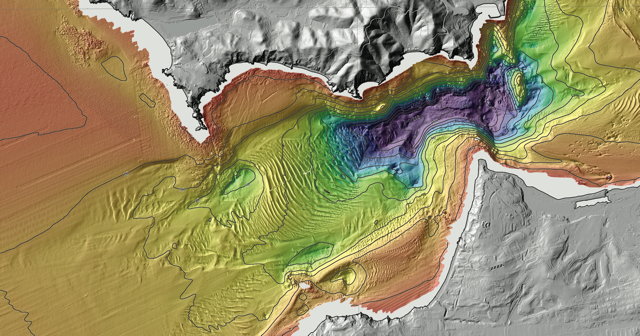
New seafloor maps of the Monterey Bay area have been released as part of the California Seafloor Mapping Program. The maps “reveal the diverse and complex range of seafloor habitats along 130 kilometers (80 miles) of the central California coast from the Monterey Peninsula north to Pigeon Point.” [Leventhal Map Center]

Previously: Mapping the California Sea Floor.

USGS Earthquake Forecast Maps Now Include Human-Induced Earthquakes

usgs-induced-earthquakes

For the first time, USGS forecast maps that measure the potential damage from earthquakes in the coming year now include human-induced earthquakes, such as those caused by hydraulic fracking. (Oklahoma looms large for that very reason.) Maps for the western U.S., where a different methodology is used, presume that all earthquakes are natural in that region. [Max Galka]

Copper Plates Used to Make Topo Maps on Display

msu-copper-plate

The Michigan State University Map Library now has on display three copper plates used to make the 1912 USGS topographic map of the Lansing, Michigan area. “From the 1880s to the 1950s, the U.S. Geological Survey used engraved copper plates in the process of printing topographic and geographic quadrangle maps. Copper alloy engraving plates were inscribed with a mirror image of the points, contour lines, symbols, and text that constitute a topographic map. Each plate was inscribed with details for a single color of ink.” [via]

Digital Geologic Map of Alaska

A new geologic map of Alaska has been published by the U.S. Geological Survey. From the USGS release: “This map is a completely new compilation, carrying the distinction of being the first 100 percent digital statewide geologic map of Alaska. It reflects the changes in our modern understanding of geology as it builds on the past. More than 750 references were used in creating the map, some as old as 1908 and others as new as 2015. As a digital map, it has multiple associated databases that allow creation of a variety of derivative maps and other products.” The map is available traditionally in two PDF sheets, as well as in geodatabase, Shapefile and other database formats.