When I saw the xkcd for October 6th, I said to myself: that can’t be right. But I checked and yes, Wollaston Lake and Isa Lake are bifurcation lakes, so it is.

When I saw the xkcd for October 6th, I said to myself: that can’t be right. But I checked and yes, Wollaston Lake and Isa Lake are bifurcation lakes, so it is.

Randall Munroe’s map projection humour is increasingly on point, as last Friday’s xkcd demonstrates. (The mouseover text is even better: “There are two rules on this ship: Never gaze back into the projection abyss, and never touch the red button labeled DYMAXION.”)
Previously: xkcd: The Greenland Special; xkcd: All South Americas; Blame the Mercator Projection; xkcd’s Time Zone Map; xkcd’s Liquid Resize Map Projection.

How this map isn’t nothing but Columbuses and Springfields, I have no idea.

NASA Earth Observatory: “The map above shows air temperatures across the United States on September 6, 2020, when much of the Southwest roasted in a dramatic heatwave. The map was derived from the Goddard Earth Observing System (GEOS) model and represents temperatures at 2 meters (about 6.5 feet) above the ground. The darkest red areas are where the model shows temperatures surpassing 113°F (45°C).” Heat waves in southern California have become “more frequent, intense, and longer-lasting,” the article goes on to say.

One-third of the United States is currently affected by at least moderate levels of drought, NASA Earth Observatory reports.
The map above shows conditions in the continental U.S. as of August 11, 2020, as reported by the U.S. Drought Monitor program, a partnership of the U.S. Department of Agriculture, the National Oceanic and Atmospheric Administration, and the University of Nebraska—Lincoln. The map depicts drought intensity in progressive shades of orange to red and is based on measurements of climate, soil, and water conditions from more than 350 federal, state, and local observers around the country. NASA provides experimental measurements and models to this drought monitoring effort.
According to the Drought Monitor, more than 93 percent of the land area in Utah, Colorado, Nevada, and New Mexico is in some level of drought; 69 percent of Utah is in severe drought, as is 61 percent of Colorado. More than three-fourths of Oregon, Arizona, and Wyoming are also in drought. The effects of “severe” drought include stunted and browning crops, limited pasture yields, dust storms, reduced well water levels, and an increase in the number and severity of wildfires. Most of those areas had no sign of drought in the mid-summer of 2019.

NASA has released a map of the likely extent of damage from Tuesday’s explosion in Beirut.
Synthetic aperture radar data from space shows ground surface changes from before and after a major event like an earthquake. In this case, it is being used to show the devastating result of an explosion.
On the map, dark red pixels—like those present at and around the Port of Beirut—represent the most severe damage. Areas in orange are moderately damaged and areas in yellow are likely to have sustained somewhat less damage. Each colored pixel represents an area of 30 meters (33 yards).
The map is based on data from the European Space Agency’s Copernicus Sentinel program, and was analyzed by NASA’s Advanced Rapid Imaging and Analysis team and the Earth Observatory of Singapore.

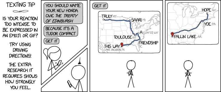
The latest xkcd comic suggests a fiendish way to express yourself: by creating phrases from driving direction waypoints.
An obvious upgrade would be to use one or more of the places from the Magnificently Rude Map of World Place Names (previously).

xkcd is back with another bad map projection: in this one, it’s all South Americas. The alt-text: “The projection does a good job preserving both distance and azimuth, at the cost of really exaggerating how many South Americas there are.”
Previously: xkcd’s Time Zone Map; xkcd’s Liquid Resize Map Projection; xkcd’s United States Map.
![]()
Argentina-based PixelDanc3r’s animated pixel art map of the United States evokes 16-bit console video games of a few decades ago. It isn’t their first rodeo either: see this pixel map of Argentina from last year. [Boing Boing]

This is a map of Antarctic surface ice velocity: the speed at which glaciers flow. It was produced by researchers at the University of California Irvine and the Jet Propulsion Laboratory, using radar interferometry and multiple satellite passes to produce a map 10 times more accurate than previous maps. More: UCI News, Geophysical Research Letters.

This interferogram shows the ground displacement caused by last week’s earthquakes in southern California. Produced by NASA’s Jet Propulsion Laboratory, it’s based on synthetic aperture radar (SAR) images from JAXA’s ALOS-2 satellite taken both before (16 April 2018) and after (8 July 2019) the earthquakes. Each colour cycle represents 12 centimetres (4.8 inches) of ground displacement.

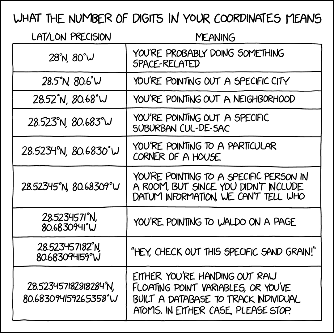
In Monday’s xckd, Randall Munroe points out that when it comes to coordinate precision, there is such a thing as too many decimal places.

Europe is in the middle of a severe heat wave. The European Space Agency has released a map of land temperatures in Europe as of 26 June, produced from the Copernicus Sentinel-3 satellite’s temperature radiometer, “which measures energy radiating from Earth’s surface in nine spectral bands—the map therefore represents temperature of the land surface, not air temperature which is normally used in forecasts. The white areas in the image are where cloud obscured readings of land temperature and the light blue patches are either low temperatures at the top of cloud or snow-covered areas.”

“An Anciente Mappe of Fairyland,” produced by Bernard Sleigh around 1917, is a marvellous conflation of classical myth and fairy tales. Nearly five feet wide, it was apparently designed to hang in nurseries. The echoes of its design elements can still be seen in later fantasy maps and children’s book illustrations, such as E. H. Shepard’s maps of the Hundred Acre Wood and Pauline Baynes’s maps of Narnia, though none of them are this vibrant.
It was making the rounds a month or two back, probably because a copy was being offered for sale: Atlas Obscura, Kottke. High-resolution digital versions are available via the Boston Public Library’s Leventhal Center, the British Library and the Library of Congress; the Leventhal’s reproduction is is much more brightly coloured and in the best shape. The map came with an accompanying booklet.
Previously: The British Library on Fantasy Maps.
To mark the 70th anniversary of the legislation creating the United Kingdom’s national parks, the Ordnance Survey has released the above poster showing each of Britain’s 15 national parks in relief. The 84 × 119 cm poster can be had for £15 via the Ordnance Survey’s shop.