Two recent posts at the British Library’s Maps and Views Blog provide “a whistle-stop tour through maps held in the British Library that chart Antarctica’s gradual emergence from obscurity into light.” The first covers maps of Antarctica through the nineteenth century, when the continent went from unknown to unexplored; the second the twentieth century, where maps of the continent “[reflect] the switch made by cartography to digital data from the latter part of the twentieth century.”
Tag: Antarctica
Mapping the Flow of Antarctic Ice
This is a map of Antarctic surface ice velocity: the speed at which glaciers flow. It was produced by researchers at the University of California Irvine and the Jet Propulsion Laboratory, using radar interferometry and multiple satellite passes to produce a map 10 times more accurate than previous maps. More: UCI News, Geophysical Research Letters.
Antarctica at Eight-Metre Resolution
The Reference Elevation Model of Antarctica is a terrain map of nearly the entire continent at eight-metre resolution, assembled from observations from polar-orbiting satellites (mostly in 2015 and 2016). Version 1 covers 98 percent of Antarctica, and observations are ongoing. Notably, each grid point is timestamped, which will allow researchers to track changes over time (useful when your continent is melting). Raw data is available for download, as are map posters; the data is also available via web apps. [Geographical]
Early Radar Maps of Antarctica Digitized
Nature: “Glaciologists will soon have a treasure trove of data for exploring how Antarctica’s underbelly has changed over nearly half a century. An international team of researchers has scanned and digitized 2 million records from pioneering aeroplane radar expeditions that criss-crossed the frozen continent in the 1960s and 1970s. […] The digitized data extend the record of changes at the bottom of the ice sheet, such as the formation of channels as Antarctica’s ice flows, by more than two decades.” (Modern radar mapping of Antarctica apparently only began in the 1990s.) [WMS]
British Antarctic Survey Remeasures Mount Hope
This BBC News article leads with a reasonably interesting geographic fact: that Mount Hope, on the Antarctic Peninsula, has been remeasured at 3,239 metres, making it the tallest mountain in territory claimed by the United Kingdom. (Its location is also claimed by Argentina and Chile.) But it’s really about the British Antarctic Survey, who are using stereographic satellite data to create more accurate maps of Antarctica’s mountains for pilots operating on the continent. BAS press release. [Kenneth Field]
Crowdsourced Satellite Image Analysis
There are many circumstances where the amount of data vastly exceeds the ability to process and analyze it—and computers can only do so much. Enter crowdsourcing. Steve Coast points to Digital Globe’s Tomnod project, which basically crowdsources satellite image analysis. In the case of the current project to map the presence of Weddell seals on the Antarctic Peninsula and the ice floes of the Weddell Sea, users are given an image tile and asked to indicate whether there are seals in the image. It’s harder than it looks, but it’s the kind of routine task that most people can do—many hands, light work and all that—and it helps researchers focus their attention where it needs focusing. (A similar campaign for the Ross Sea took place in 2016.)
Another ongoing campaign asks users to identify flooded and damaged infrastructure and trash heaps in post-Hurricane Maria Puerto Rico.
The Penguin Projection
“A world map tells a lot about the person who has made it, or about the market it is made for,” says Frans Blok. The edges of equatorial projections are determined so as to put the map’s audience at the centre of the map: European maps put the Bering Strait at the edges, Australian and Asian maps the Atlantic, American maps break Asia in two. If, however, only the polar regions were habitable—or if you were making a map for penguins—you might use a polar projection centred on Antarctica.
“And no, for European use this map is less suitable. But there aren’t that many penguins living here,” says Blok. [ICA]
Mapping Antarctica’s Bedrock
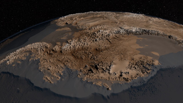
NASA has released an updated map of the bedrock beneath the Antarctic ice sheet; the map, called Bedmap2, adds considerable detail—a tighter grid and millions of data points—to its decade-old predecessor. The image above exaggerates vertical scale by a factor of 17 to increase visibility. See also this short video.