New Leventhal Exhibition: Processing Place

An exhibition exploring the history of computerized mapping, GIS and remote sensing opened at the Boston Public Library’s Leventhal Map Center last Friday. Processing Place: How Computers and Cartographers Redrew our World runs until March 2025.

In the long history of mapmaking, computers are a relatively new development. In some ways, computers have fundamentally changed how cartographers create, interpret, and share spatial data; in others, they simply mark a new chapter in how people have always processed the world. This exhibition features objects from the Leventhal Center’s unique collections in the history of digital mapping to explore how computers and cartographers changed one another, particularly since the 1960s. By comparing maps made with computers to those made before and without them, the exhibition invites us to recognize the impacts of digital mapping for environmental management, law and policy, navigation, national defense, social change, and much more. Visitors will be encouraged to consider how their own understanding of geography might be translated into the encodings and digital representations that are essential to processing place with a computer.

The online version of the exhibition is here.

Thematic Mapping and the 2024 U.K. Election

John Nelson, Esri

There’s more than one way to depict data on a map. At the last Esri user conference, Sarah Bell, Kenneth Field and John Nelson demonstrated different ways to map the results of the last U.K. parliamentary election, and how they changed from the previous election. The video of their presentation is attendee-only, but Ken and John have posted about how they each went about their tasks: here’s Ken’s post and here’s John’s; plus, as is his wont, John has posted a video.

Null Island as Easter Egg

Stamen Maps

Null Island is an inside joke among cartographers: an imagined island situated at 0° latitude, 0° longitude, where maps suffering from data glitches point themselves. If your map is centred on Null Island, something has gone wrong. So of course mapmakers have been having some fun with it—after all, it’s not something you could stumble across by accident. In a blog post, Alan McConchie of Stamen Maps delves into the lore and history of Null Island and its status as an Easter egg on the Stamen Maps platform, where it takes the shape of the island from the Myst game.

(As an update to my 2016 post on Null Island: Alan reports that the buoy at 0°, 0° has ceased to be. Also, the Null Island website, complete with flag, has moved here.)

Choosing Colours

On the ArcGIS Blog, Heather White has a series of video-tutorial posts exploring how to choose colour1 when making maps, and what colours can signify on a map. From Color connotations and associations: “Colors are never neutral. They affect how people think and feel about your map. As a cartographer, you should be aware of the connotations and associations carried by the colors you use. They can be powerful tools to help you communicate more clearly. But if you ignore them, they can just as easily sabotage your map’s message.” See also Light and dark color schemes and Choose similar colors to map similar things (which you’d think would go without saying, but then things that ought to go without saying almost always need saying).

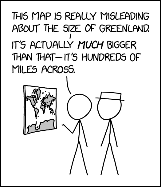
xkcd on Greenland’s Size

xkcd: Greenland Size (25 Mar 2024)
Randall Munroe, “Greenland Size”, xkcd, 25 March 2024.

The 25 March 2024 xkcd honours Greenland’s place as a measure of cartographic distortion. It’s also, unexpectedly, a riff on the idea of the 1:1 scale map (cf. Borges), especially if you consult the comic’s alt text: “The Mercator projection drastically distorts the size of almost every area of land except a small ring around the North and South Poles.”

Previously: xkcd: The Greenland Special.

Heart-Shaped Maps

A Modern and Complete Map of the World by the Royal Mathematician Oronce Fine of the Dauphiné (1534). Library of Congress website.Today might be a good day to look at cordiform map projections—maps in the shape of a heart. This Geography Realm post (and related video) looks at the history of such projections, such as the Werner and Bonne, which first saw use in the 16th and 17th centuries. This Library of Congress blog post explores two maps that use the projection: a 1795 Ottoman Turkish map attributed to a Tunisian cartographer, and the 1534 map by Oronce Finé (pictured) that apparently inspired it.

The Opposite of Cartographic Generalization

In the above video, the Ticket to Know YouTube channel looks at the idea of cartographic generalization—where a map at smaller scale must necessarily remove detail to preserve legibility, to the extent that cities with very large populations (like Baltimore, Guangzhou or Yokohama) get left off the map because they’re near even larger or more significant cities get left off the map. As well as its opposite: where tiny population centres get put on the map because they’re in empty spaces (which maps have always hated). His example is Alice Springs; mine would have been a Canadian Arctic settlement like Churchill, Manitoba, population 870, which tends to appear even on globes.

Edney on Arno Peters

Matthew Edney has written a long blog post on Arno Peters and his map.

I’ve been struggling for months now on how to deal with Arno Peters and his world map. Every time I turn to the subject, I just get bogged down by the complexity of the scattered and multifaceted literature, by the insanity of much of Peters’ map work, and by the different responses to his work. […] After at least three tries to say something new, and floundering each time, I am presenting this blog entry simply as an attempt to organize the information about Peters in a way that makes sense to me, which is to say historically. Think of it as a long bibliographical essay based on what I have to hand (so not comprehensive, especially in the German-language literature). I’m not sure that it says anything necessarily new or significant. So please join me as I go through a series of cuts at Peters and his map work.

Field’s Favourites for 2023

Another end-of-year tradition is Kenneth Field posting a roundup of his favourite maps of the year. The 2023 iteration is the usual mix of the very good (e.g. Eric Knight’s Tien Shan and Anton Thomas’s Wild World) and the extremely original, such as Chicago’s L depicted in snake form, or a river map designed for a receipt printer.

Previously: Field’s Favourites for 2022; Maps at Year’s End.

‘Where Comedy Meets Geography’

Geographical magazine has a profile of the Map Men—that is, Jay Foreman and Mark Cooper-Jones, who’ve been posting funny videos on YouTube that explain some cartographical or geographical silliness since 2016, on and off.

‘As little as ten years ago, maps were something that you just had to live with and everybody had an A-to-Z in the car,’ says Jay, who is the main comedic influence behind the channel, having already found success with a series on London’s architecture called Unfinished London. ‘But now that everyone has a sat nav, I think maps have become, for want of a better word, more geeky. You get people who didn’t realise that they were interested in maps or geography until they see an episode of Map Men and they’ll say: “Oh, yeah, maps are my guilty pleasure.” And I don’t think people would have necessarily talked like that about maps ten years ago, because they used to be something that we depended on. And now they have become something that we enjoy.’

(See previous posts.)

Bad Maps, Kindness and Empathy

The 2023 iteration of the 30 Day Map Challenge is coming up, and Daniel Huffman has some thoughts about the day four prompt (“a bad map”) and making room for kindness in the mapmaking community.

It’s fun to play with those things that you’re not supposed to do! But, these are also same kinds of choices that might be made by someone who’s new to our community, and who isn’t as experienced. I’ve seen plenty of students who start out their careers by producing work that is very similar to the material that my colleagues produced when they were prompted to make “a bad map.”

Imagine, then, being one of those novices and seeing someone out there make something in the same style as you, and then see people laugh at it. Might you learn a useful lesson about design? Maybe. But there’s a kinder and more effective way to teach the next generation, isn’t there? […]

It’s no secret that I think our community has had a history of toxic critique and gatekeeping. I’ve written about it here, and talked about it at NACIS. This year, when prompted to make “a bad map,” I invite you to think of “bad” in more ways than just “what a beginner would make.”

Previously: Thirty Day Map Challenge; ‘One Bad Map a Day in February’.

A Book Roundup: Recent New Publications

Book cover: A History of the World in 500 MapsWriting for Geographical magazine, Katherine Parker reviews A History of the World in 500 Maps by Christian Grataloup (Thames & Hudson, 13 Jul 2023), which was originally published in French in 2019. “[E]ven with 500 maps, there’s a selection process at work that may leave some readers wanting for specific trajectories and topics. For example, although there’s a continual emphasis on economics, commerce and migration, the impact of the Transatlantic slave trade is only lightly addressed. Similarly, Indigenous perspectives are present, but not abundant. However, such critiques of lacuna in subject coverage are inevitable in any book that attempts to include all of human history.” Note that the maps are modern maps of history created for this book, not old maps. UK-only publication. £35. Amazon UK.

Book cover: Esri Map Book Volume 38The 38th volume of the Esri Map Book (Esri, 5 Sep 2023) came out earlier this month. Like the NACIS Atlas of Design (previously),1 it’s a showcase of maps presented at a conference—in this case, maps from the Map Gallery exhibition of Esri’s International User Conference. The Esri Map Book website has a gallery of maps presumably from this volume, and given the number of pages in the book (140) and the number of maps in the gallery (65), it may actually be complete (assuming a two-page spread per map). $30. Amazon (Canada, UK), Bookshop.

Book cover: The GlobemakersPeter Bellerby, of bespoke premium globemaker Bellerby & Co. fame, has written a book: The Globemakers: The Curious Story of an Ancient Craft (Bloomsbury) is out today in hardcover in the UK, and in North America on October 17; the ebook is available worldwide as of today. From the publisher: “The Globemakers brings us inside Bellerby’s gorgeous studio to learn how he and his team of cartographers and artists bring these stunning celestial, terrestrial, and planetary objects to life. Along the way he tells stories of his adventure and the luck along the way that shaped the company.” £25/$30. Amazon (Canada, UK), Bookshop.
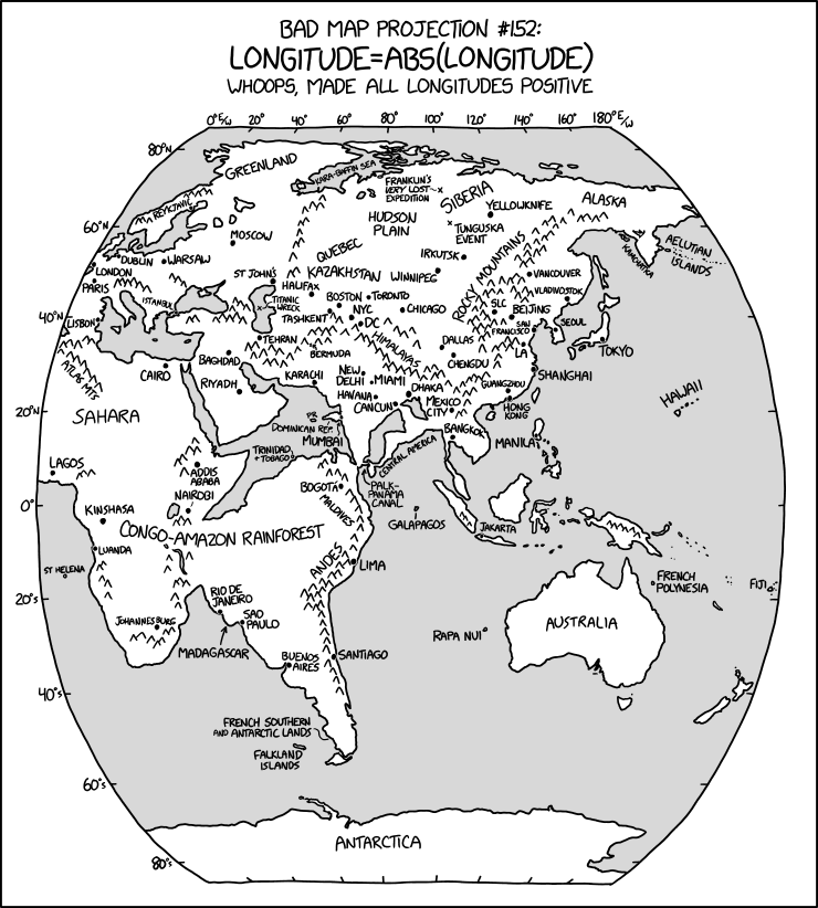
‘Whoops, Made All Longitudes Positive’

xkcd:Bad Map Projection: ABS(Longitude)
Randall Munroe, “Bad Map Projection: ABS(Longitude),” xkcd, 26 Jul 2023.

The latest in Randall Munroe’s Bad Map Projection series on xkcd is perhaps his most evil yet: it turns all longitudes positive—i.e., it turns west longitude into east longitude, putting Quebec somewhere in Kazakhstan and the Panama Canal off Sri Lanka.

Map Men on Why North Is Up

The latest episode of Jay Foreman and Mark Cooper-Jones’s all-too-infrequent series Map Men looks at why north is at the top of modern maps, and features examples of maps where this was, or is, not the case, and why.

For something a bit more … academic, see Mick Ashworth’s Why North Is Up: Map Conventions and Where They Came From (Bodleian, 2019).

Previously: The Origins of North at the Top of Maps; The Idea of North.

Review: Atlas of Design, Vol. 6

Late last year I received, as a review copy, the sixth volume of the Atlas of Design. Things being what they are around here, there has been somewhat of a gap between receiving it, reading it, and saying something about it. But it’s worth saying something about that volume now, and the Atlas of Design in general, for at least one small reason I’ll get to in a moment.

I’ve mentioned the Atlas of Design series before, but it’s worth introducing it properly. Published every two years since 2012 by the North American Cartographic Information Society, the Atlas of Design is powered by volunteer editors and contributor submissions. Nobody’s getting paid for working on or appearing in these volumes—though it must be said that many of these maps are commercial ventures (posters available for sale at the mapper’s website) or works for hire (National Geographic and the Washington Post are represented in volume six), so the mapmakers aren’t doing this just for the exposure.

Continue reading “Review: Atlas of Design, Vol. 6”