

More proof that Randall hates us and wants to hurt our eyes comes from last Wednesday’s xkcd, which does what I’m pretty sure no cartogram has ever done: size by alphabetical order.
More proof that Randall hates us and wants to hurt our eyes comes from last Wednesday’s xkcd, which does what I’m pretty sure no cartogram has ever done: size by alphabetical order.

Looks like we’re not quite done with eclipse maps, especially the whimsical sort, and it’s not at all invalid for xckd to have (what is probably going to be) the last word on the subject (at least for a while), with this fictional map showing the fictional path of a fictional eclipse over a fictional landscape, with rueful descriptions of fictional places where trying to see the fictional eclipse will come to a bad end for the fictional observers. (And you thought it was bad you got clouds.)
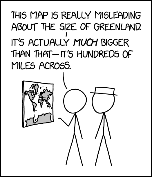
The 25 March 2024 xkcd honours Greenland’s place as a measure of cartographic distortion. It’s also, unexpectedly, a riff on the idea of the 1:1 scale map (cf. Borges), especially if you consult the comic’s alt text: “The Mercator projection drastically distorts the size of almost every area of land except a small ring around the North and South Poles.”
Previously: xkcd: The Greenland Special.
Over on Strange Maps, which like this here site is still a going concern, Frank Jacobs has a nice writeup of the history of perception maps. These are maps that provide a skewed or exaggerated view, usually of the United States, that favours their preferred part of it. The best known is Saul Steinberg’s 1976 New Yorker cover (“View of the World from 9th Avenue”) but there were antecedents. Frank covers the examples I mentioned in these previous entries: McCutcheon’s View; McCutcheon’s 1908 Cartoon. Plus a few others.

Inspired, he says, by Itchy Feet’s maps of Every European City and Every American City, Alfred Twu has come up with a Map of Every Chinese City. (Chinese version here.) Twu is no stranger to these parts: he worked on rail maps for California and the Northeast Corridor some years back.
Previously: Itchy Feet’s Map of Every European City; Itchy Feet’s Map of Every American City.

How this map isn’t nothing but Columbuses and Springfields, I have no idea.
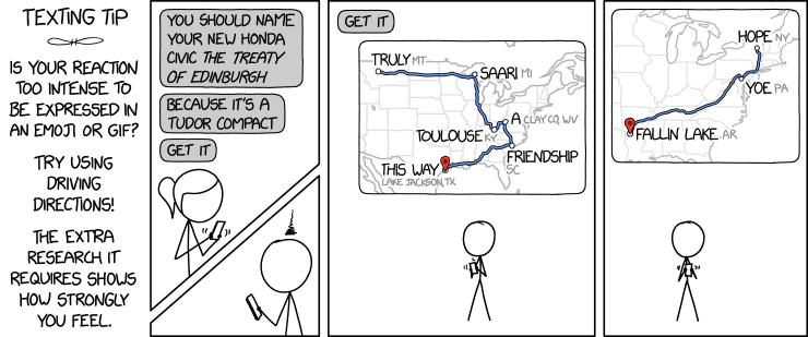
The latest xkcd comic suggests a fiendish way to express yourself: by creating phrases from driving direction waypoints.
An obvious upgrade would be to use one or more of the places from the Magnificently Rude Map of World Place Names (previously).

xkcd is back with another bad map projection: in this one, it’s all South Americas. The alt-text: “The projection does a good job preserving both distance and azimuth, at the cost of really exaggerating how many South Americas there are.”
Previously: xkcd’s Time Zone Map; xkcd’s Liquid Resize Map Projection; xkcd’s United States Map.

Itchy Feet cartoonist Malachi Rempen gives us a sequel to his “Map of Every European City”: the equally true and accurate “Map of Every American City.”
Previously: Itchy Feet’s Map of Every European City.

The latest cartoon from Itchy Feet, a comic about travel and language by filmmaker Malachi Rempen, is a “Map of Every European City.” In the comments, the cartoonist says, “Having been to every single European city, I can safely say with confidence that they all look exactly like this.” I don’t think he’s wrong.
Updated "Serio-Comic Map" of Europe 2018 (after Fred W Rose), complete with Renaissance "wind-heads" for a nice, satisfied client. Lot of work but very enjoyable (and probably out of date by tomorrow) #politics #Europe pic.twitter.com/BB3ZNVFW8u
— Andy Davey (@DaveyCartoons) June 18, 2018
In December 2016 cartoonist Andy Davey created, for a private client, a modern-day “serio-comic” map of Europe in the style of the caricature maps that proliferated in the late 19th and early 20th centuries. Now he’s created another one in the same style, this one even better than the last: it features political figures in the shape of their countries, with leaders from elsewhere in the world blowing wind in Europe’s direction. Very easy to get lost in the detail here. [WMS]

We’ve seen “serio-comic” or caricature maps before, most of them dating from the late 19th and early 20th centuries, but Caitlin takes us behind the scenes with a story about one of the artists behind such maps. The twelve maps published in Geographical Fun: Being Humourous Outlines of Various Countries (1868) were the handiwork of a 15-year-old teenager named Lilian Lancaster, who originally drew them to amuse her ill brother. Which is a great and surprising twist. The accompanying text (an introduction and accompanying verses) was by William Harvey (under a pseudonym), who tried to make an educational case for such maps (as one did).

It’s been a while since we last saw a map of Donald Trump’s world view (previously), but now, inspired by the president’s reported comments about shithole countries, we have a new one from The New Yorker’s Peter Kuper. [Facebook/Twitter]
Previously: The Huffington Post Maps Trump’s World.

Tom Gauld’s definition of psychogeography seems rather cutting.
interesting job for private client; map a la 20thC political cartoon maps of Fred Rose etc; have taken liberties with geography pic.twitter.com/fm0nAR22tE
— Andy Davey (@DaveyCartoons) December 12, 2016
Last December political cartoonist Andy Davey posted a modern-day caricature map that hearkens back to the eve of the First World War, when such “serio-comic” cartographic portraits were common, but fully up-to-date and relevant to the Trump-Putin era. [Maps on the Web]