
In the latest iteration of xkcd’s series of bad map projections, Randall puts Kansas—the putative centre of the contiguous 48 states—at the edge of the map.

In the latest iteration of xkcd’s series of bad map projections, Randall puts Kansas—the putative centre of the contiguous 48 states—at the edge of the map.

More proof that Randall hates us and wants to hurt our eyes comes from last Wednesday’s xkcd, which does what I’m pretty sure no cartogram has ever done: size by alphabetical order.
There’s no shortage of books about phantom islands—islands on the map that later turn out never to have existed—but now the Map Men have done a video about them, using as a narrative hook the case of Sandy Island, and how it managed to stay on maps into the Google Maps era.

Looks like we’re not quite done with eclipse maps, especially the whimsical sort, and it’s not at all invalid for xckd to have (what is probably going to be) the last word on the subject (at least for a while), with this fictional map showing the fictional path of a fictional eclipse over a fictional landscape, with rueful descriptions of fictional places where trying to see the fictional eclipse will come to a bad end for the fictional observers. (And you thought it was bad you got clouds.)
This Mastodon post makes a bad map of this week’s eclipse into the funniest map of this week’s eclipse.
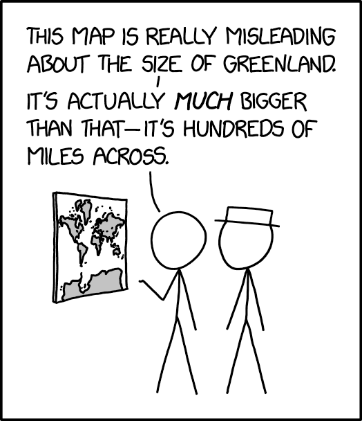
The 25 March 2024 xkcd honours Greenland’s place as a measure of cartographic distortion. It’s also, unexpectedly, a riff on the idea of the 1:1 scale map (cf. Borges), especially if you consult the comic’s alt text: “The Mercator projection drastically distorts the size of almost every area of land except a small ring around the North and South Poles.”
Previously: xkcd: The Greenland Special.
Geographical magazine has a profile of the Map Men—that is, Jay Foreman and Mark Cooper-Jones, who’ve been posting funny videos on YouTube that explain some cartographical or geographical silliness since 2016, on and off.
‘As little as ten years ago, maps were something that you just had to live with and everybody had an A-to-Z in the car,’ says Jay, who is the main comedic influence behind the channel, having already found success with a series on London’s architecture called Unfinished London. ‘But now that everyone has a sat nav, I think maps have become, for want of a better word, more geeky. You get people who didn’t realise that they were interested in maps or geography until they see an episode of Map Men and they’ll say: “Oh, yeah, maps are my guilty pleasure.” And I don’t think people would have necessarily talked like that about maps ten years ago, because they used to be something that we depended on. And now they have become something that we enjoy.’
(See previous posts.)
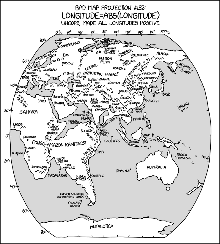
The latest in Randall Munroe’s Bad Map Projection series on xkcd is perhaps his most evil yet: it turns all longitudes positive—i.e., it turns west longitude into east longitude, putting Quebec somewhere in Kazakhstan and the Panama Canal off Sri Lanka.
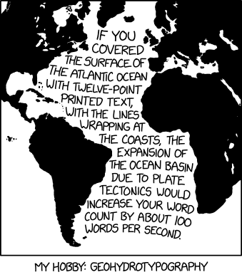
Well, that’s one way to visualize the rate of continental drift.
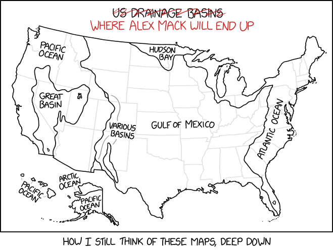
This xkcd cartoon requires deep Nickelodeon knowledge to understand.
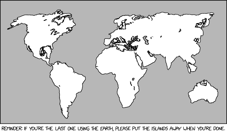
The xkcd from last Friday, “Island Storage,” is the most recent map-related way that Randall Munroe has hurt us in the eyes.
Saturday Morning Breakfast Cereal has a take on what GPS does to our ability to navigate.
Sometimes a terrible old movie is only watchable when you add an audio track in which it’s being brutally and relentlessly mocked: this was the MO of Mystery Science Theater 3000 and RiffTrax, the latter featuring plenty of MST3K alumni. Such is the case with this 1949 educational film, late 1949, “What Is a Map,” which takes an awfully long time to (a) well, do much of anything and (b) get to the subject of maps, so RiffTrax’s version makes it a bit easier to stomach. A bit.
 The Onion: Underwhelming Fantasy Novel Starts With Map Of Ohio. “Feeling let down to see a straightforward rendering of the Midwestern state, local reader Kyle Nuebart reported Friday that underwhelming fantasy novel Dayton Rising featured a map of Ohio in its opening pages.” I’m impressed that they went to the trouble of creating a fantasy map of Ohio to illustrate a one-joke article (admittedly, it’s a really good joke).
Previously: The Onion on Fantasy Maps.
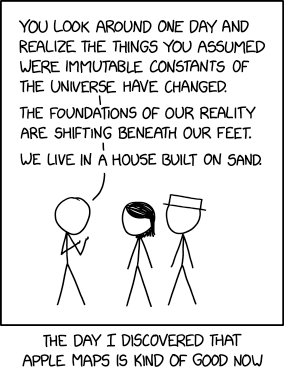 The notion expressed in Monday’s xkcd, particularly in the alt-text—
OpenStreetMap was always pretty good but is also now really good? And Apple Maps’s new zoomed-in design in certain cities like NYC and London is just gorgeous. It’s cool how there are all these good maps now!
—is unexpectedly more on point than not.
In 2013 I wrote a screed saying that all online maps sucked: that no one map platform had a monopoly on errors. At the time Exhibit A for the suckiness of online maps was Apple Maps; since then, and particularly since 2018, Apple has been putting in the work. Not that they’re done, but still: the product is fundamentally better now than it was then. And it’s not like the other platforms have been idle in the meantime. No one platform is going to achieve Cartography’s ideal of the universal and accurate Map—that’s inherently unachievable—but better? I’ll take better.