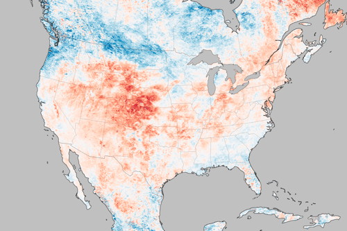
NASA Earth Observatory: “The map above shows air temperatures across the United States on September 6, 2020, when much of the Southwest roasted in a dramatic heatwave. The map was derived from the Goddard Earth Observing System (GEOS) model and represents temperatures at 2 meters (about 6.5 feet) above the ground. The darkest red areas are where the model shows temperatures surpassing 113°F (45°C).” Heat waves in southern California have become “more frequent, intense, and longer-lasting,” the article goes on to say.
Tag: temperature
Mapping Heat Islands in U.S. Cities
The temperature on a hot summer day in a single city can vary by as much as 11 degrees Celsius depending on where you are—whether you’re near green spaces that cool down the surrounding areas, or pavement and concrete, which absorb heat and radiate it. That’s the heat island effect, and mapping it is the focus of a project led by Portland State University researchers, funded in part by NOAA, and conducted by on-the-ground volunteers who have been taking temperature measurements across a number of U.S. cities. Those measurements have been cross-referenced with other data about the neighbourhoods, which will help cities figure out how to keep their citizens cool during heat waves—which, let’s face it, are going to be a lot more common going forward. National Geographic, New York Times.
Europe’s Heat Wave, as Seen from Orbit
Europe is in the middle of a severe heat wave. The European Space Agency has released a map of land temperatures in Europe as of 26 June, produced from the Copernicus Sentinel-3 satellite’s temperature radiometer, “which measures energy radiating from Earth’s surface in nine spectral bands—the map therefore represents temperature of the land surface, not air temperature which is normally used in forecasts. The white areas in the image are where cloud obscured readings of land temperature and the light blue patches are either low temperatures at the top of cloud or snow-covered areas.”
Mapping Disasters in America
The Washington Post maps disasters in the United States, with a page that shows maps of flood warnings, tornadoes and hurricanes, extreme heat and cold (see above), wildfires, lightning, and earthquakes and volcanoes. In the wake of a natural disaster there’s usually someone suggesting that the victims are at fault for living in a disaster zone. The WaPost’s maps have an answer to that: “It turns out there is nowhere in the United States that is particularly insulated from everything.”
The Polar Vortex, Visualized
NASA Earth Observatory maps the bitterly cold temperatures resulting from cold air pushed southwards by an unstable polar vortex. The maps and animations are by Earth Observatory’s lead cartographer, Joshua Stevens. On Twitter he posted a companion visualization showing what’s happening on the other side of the planet, where a searing heat wave is blistering Australia.
Meanwhile on the other side of the planet ?, @NASA ?️ data shows #Australia's daytime temperatures are soaring (≥40 °C) pic.twitter.com/hvBuEez4G6
— Joshua Stevens (@jscarto) January 31, 2019
Surface Temperatures Warmest Since 1880
According to analyses by NASA and NOAA scientists, 2015 was the warmest year on record, with average surface temperatures the highest they’ve been since 1880. The above video shows the long-term warming trend since 1880 as a five-year rolling average. The baseline average is from 1951 to 1980; orange colours are warmer than that average, blue colours cooler. (Credit: GSFC Scientific Visualization Studio.)
Mapping the Heat Wave
Hotter than usual? Yes. This map shows how much land surface temperatures during the week of June 17-24, 2012 have been above or below the average for 2000-2011. Now this map measures something very specific: land surface temperatures (LSTs) aren’t the same as air temperatures: “LSTs indicate how hot the surface of the Earth would feel to the touch. From a satellite vantage point, the ‘surface’ includes a number of materials that capture and retain heat, such as desert sand, the dark roof of a building, or the pavement of a road. As a result, daytime land surface temperatures are usually higher than air temperatures.” Via Bad Astronomy.