Scientists have been tracking seasonal freeze-thaw patterns for 30 years. This map, produced from data collected by NASA’s Soil Moisture Active Passive satellite, “shows the freeze-thaw status of areas north of 45 degrees latitude on March 5, 2015, as spring approached. Frozen land is blue; thawed land is pink. The measurement is possible because frozen water forms crystalline structures that can be detected by satellites.” NASA Earth Observatory.
Tag: earth observatory
Mapping the Heat Wave

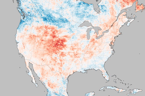
Hotter than usual? Yes. This map shows how much land surface temperatures during the week of June 17-24, 2012 have been above or below the average for 2000-2011. Now this map measures something very specific: land surface temperatures (LSTs) aren’t the same as air temperatures: “LSTs indicate how hot the surface of the Earth would feel to the touch. From a satellite vantage point, the ‘surface’ includes a number of materials that capture and retain heat, such as desert sand, the dark roof of a building, or the pavement of a road. As a result, daytime land surface temperatures are usually higher than air temperatures.” Via Bad Astronomy.

