The Atlas for the End of the World collects a series of world maps that measure our planet’s environmental well-being. More specifically, they examine the amount of protected area in our planet’s biological hotspots, especially relative to the UN Convention on Biological Diversity’s 2020 conservation targets. Created by landscape architects, the accompanying text (by project lead Richard J. Weller) tends toward the abstruse and verbose, but the maps themselves are quite interesting. (I note that they make extensive use of the Goode homolosine projection, which is refreshing.) [Geo Lounge]
Category: Environment
Mapping Great Lakes Pollution
President Trump’s budget proposes eliminating the EPA’s Great Lakes Restoration Initiative. That fact is no doubt what’s behind two publications posting maps earlier this month, only a couple of days apart, showing the environmental stresses on the Great Lakes basin.
Canadian Geographic reposted a map from their July/August 2013 issue:
And the Washington Post included the following map in an article on the proposed elimination of two EPA programs (including the aforementioned Great Lakes Restoration Initiative):
Mapping Arctic Permafrost
NASA Earth Observatory: “The map above, based on data provided by the National Snow and Ice Data Center, shows the extent of Arctic permafrost. Any rock or soil remaining at or below 0 degrees Celsius (32 degrees Fahrenheit) for two or more years is considered permafrost.” The map differentiates between continuous, discontinuous, sporadic and isolated permafrost. [NASA Earth]
Lead Exposure Risk Map
Vox’s lead exposure risk map takes a nationwide look at a crisis some might have thought was limited to Flint, Michigan. “The areas where kids are at highest risk of lead exposure—an estimate calculated using government data about the surroundings—are scattered all across the country.” Lead exposure data is hard to come by, so exposure risk is calculated based on Washington State’s methodology, which uses age of housing and poverty as risk factors. [Mapbox]
Mapping Nitrogen Dioxide Pollution
A decade’s worth of data from the Ozone Monitoring Instrument aboard the Aura satellite reveals the change in global nitrogen dioxide (NO2) pollution from 2005 to 2014: down significantly in some areas, due to stricter emissions controls, but up sharply in others. More at NASA Earth Observatory.
Lake Poopó Dries Up
[sciba leftsrc=”https://www.maproomblog.com/xq/wp-content/uploads/2016/01/lake-poopo-2013.jpg” leftlabel=”12 April 2013″ rightsrc=”https://www.maproomblog.com/xq/wp-content/uploads/2016/01/lake-poopo-2016.jpg” rightlabel=”15 January 2016″ mode=”horizontal” width=””]
Lake Poopó has become the Aral Sea of the Andes. Thanks to drought, water diversion and mining activity, the lake—long, wide, shallow, saline and the second-largest in Bolivia—has basically dried up, as this comparison of 2013 and 2016 Landsat 8 images demonstrates. CBC News, The Independent.
Map of Northern Biomass
The European Space Agency has released a map showing the northern hemisphere’s biomass — specifically, its growing stock volume (GSV), which is the amount of wood per hectare in cubic metres. The map is based on radar images taken by the now-defunct Envisat satellite between October 2009 and February 2011.
Previously: Herbal Earth.
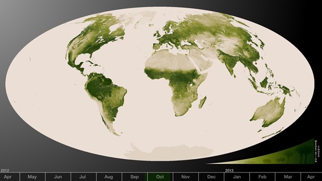
Herbal Earth
Today NASA released a set of vegetation maps based on data from the Suomi NPP satellite. Flickr photoset, YouTube video. The maps depict a year’s worth of changes in vegetation. “High values of Normalized Difference Vegetation Index, or NDVI, represent dense green functioning vegetation and low NDVI values represent sparse green vegetation or vegetation under stress from limiting conditions, such as drought.” Image credit: NASA/
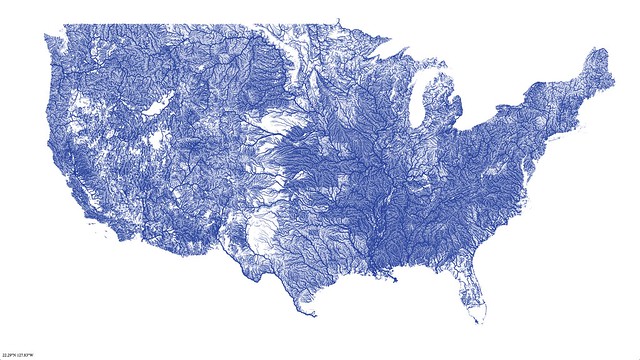
Map of All American Rivers
Nelson Minar has created a vector tile map of all the rivers in the United States. It’s an amazing map, one that is being compared with Ben Fry’s All Streets (previously) or this more recent map of U.S. roads. Only it’s rivers-only, not roads-only. Via io9 and Kottke.