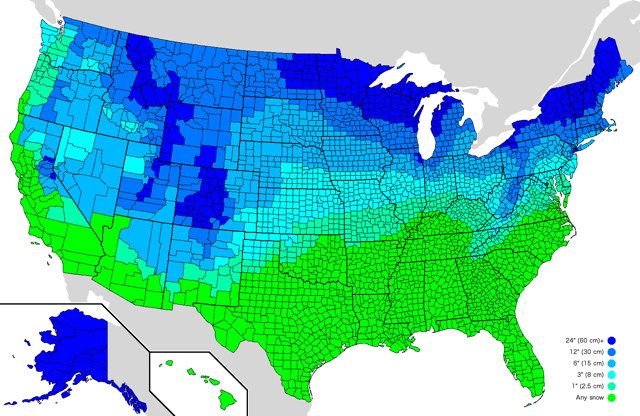
CNN: “Snowfall is declining globally as temperatures warm because of human-caused climate change, a new analysis and maps from a NOAA climate scientist show.” Meanwhile, the change in snowfall in the U.S. is more complicated: it’s down sharply in the Midwest and South but up in the Northeast.
Tag: snow
El Niño and Snowfall in North America

NOAA’s ENSO blog maps the impact of El Niño on snowfall in North America.
Obviously, snowfall is limited in its southernmost reaches because it needs to be cold enough to snow, so the effects are strongest in the higher and colder elevations of the West. To the north, however, there is a reduction in snowfall (brown shading), especially around the Great Lakes, interior New England, the northern Rockies and Pacific Northwest, extending through far western Canada, and over most of Alaska. In fact, El Niño appears to be the great snowfall suppressor over most of North America.
The above map shows the change in snowfall during all El Niño years; additional maps tease out other details (such as the difference in moderate-to-strong El Niños). [CNN]
Google Rerouted Traffic Up Poorly Maintained Mountain Roads During a Blizzard

Last week, when a snowstorm closed Interstate 80 east of Sacramento, Google Maps started redirecting traffic up poorly maintained mountain roads, which is about as good an idea during a blizzard as it sounds.
.@googlemaps This is an abject failure. You are sending people up a poorly maintained forest road to their death in a severe blizzard. Hire people who can address winter storms in your code (or maybe get some of your engineers who are stuck in Tahoe right now on it). pic.twitter.com/IzagAXzBtA
— Dr. Crystal A. Kolden 🔥 (@pyrogeog) December 28, 2021
Other dispatches from Twitter allege that the service—particularly its mobile app—directed people to closed-off highways, mountain passes and lakeside roads to get around. This is in direct contrast to Caltrans’ messaging to avoid workarounds. Caltrans District 3 spokesperson Steve Nelson told SFGATE on Monday that they were seeing drivers trying to skirt highway closures with side streets. “They’ll take side roads and try and sneak past the closures, and that never ends well,” he said.
Google engineer Sören Meyer-Eppler responded on Twitter to spell out some of the technical and logistical problems involved in rerouting traffic during bad weather: the difficulty in finding timely data (and in such cases data need to be really timely) and the risk of false positives. More at Jalopnik.
Mapping Snowfall in the United States
This map shows every inch of snow that fell on the lower 48 this winter. https://t.co/rSbAYkFEW5 pic.twitter.com/Dg9nLYHcqs
— Post Graphics (@PostGraphics) March 24, 2018
Winter isn’t quite done with us yet where I live. And with that in mind, here’s a neat animated map from the Washington Post that shows the total accumulated snowfall in the contiguous United States. The link includes 48-hour snowfall accumulation maps, satellite imagery, and a map showing which areas of the lower 48 have had more or less snowfall than Washington, D.C. I imagine these maps will have to be updated now.
Snowfall as Animated Relief Map
Here’s something neat from Garrett Dash Nelson: “the total seasonal snowfall in the continental US for 2017–2018 so far, shown as a relief map,” where total snowfall is expressed as elevation. That’s neat. Even neater: the animated gif that depicts it (a frame of which is above). Even neater than that: he shows how he made said animated gif.
NOAA’s White Christmas
NOAA maps the probability of a white Christmas across the lower 48 states: the interactive version includes clickable locations.
While the map shows the historical probability that a snow depth of at least one inch will be observed on December 25, the actual conditions in any year may vary widely from these because the weather patterns present will determine the snow on the ground or snowfall on Christmas day. These probabilities are useful as a guide only to show where snow on the ground is more likely.
While the subject may seem whimsical, it’s based on 1981-2010 Climate Normals data; this paper details into the methodology involved. (It also answers a question that climatologists and meterologists get a lot.)
Mapping How Much Snow Cancels School
Reddit user atrubetskoy has produced a map of the U.S. showing how much snow it takes to cancel school. It’s an approximation, to be sure. But it’s not a map of winter wussiness: areas that rarely get a lot of snow don’t tend to have the infrastructure to deal with it. [io9]


