I’ve seen real-time maps of Swiss trains before; this one, Trafimage, comes courtesy of the Swiss Federal Railways, and includes all kinds of information about the network: rail and bus lines, stations, fare networks, as well as real-time train data. Clicking on “Train tracker” makes the trains appear as circles moving along the rail lines; it’s apparently timetable-based rather than tracking actual trains, but remember: these are Swiss trains. [Maps Mania]
Tag: railways
Amtrak Before and After
Following up on this post about maps of cuts to Amtrak, here’s a visualization from Will Geary showing a week of Amtrak trips before and after the proposed budget cuts. [CityLab]
Mapping Amtrak Cuts
President Trump’s proposed budget would end funding for Amtrak’s long-distance passenger routes, leaving only the Northeast Corridor and state-funded lines. Maps of the lines that would be closed share the problems of Amtrak network maps in general. Take USA Today’s map from its 12 April article on the subject:
Like electoral maps that make large, less-populated areas look more important than densely populated areas, this map is somewhat deceptive: it distorts the extent of the cutbacks because it shows lines rather than trains. There are, for example, a lot more trains in the Northeast Corridor than run between Chicago and the Pacific Northwest (the daily Empire Builder). State-run services tend to have lots of lines and trains over short distances that are too small to see clearly on this map. Adding connecting services (which are usually bus routes) adds even more detail, and clutter, to a small map.
Cameron Booth, for his part, visualizes the proposed cuts by starting with his Amtrak Subway Map and greying out the lines that would be cut. This doesn’t solve the number-of-trains problem, but it does provide a clearer sense of what’s happening to the network.
Proposed budget could eliminate 15 long-distance Amtrak trains, which would leave the notionally "national" rail network looking like this: pic.twitter.com/OkBTsz8hCg
— Transit Maps (@transitmap) April 15, 2017
Previously: Cameron Booth’s Amtrak Subway Map.
1882 Isochrone Map of France
I think I'm in love: a stunning isochrone map of travel times from Paris by rail in 1882 (making this a very early example of the genre). pic.twitter.com/gaSEzGCQWI
— Transit Maps (@transitmap) March 31, 2017
Cameron Booth (of Transit Maps fame) posted an 1882 isochrone map of France showing travel times from Paris by rail to Twitter and boy did it ever go viral. He’s planning on selling a print of it on his online store.
‘The Massive Scope of America’s Infrastructure’
The Washington Post has six maps of U.S. flights, shipping lanes, electrical transmission lines, railroads and pipelines that highlight “the massive scope of America’s infrastructure” that will presumably be the focus of future Trump administration spending. [Benjamin Hennig]
A Map of Southeast Asia’s Future Rail Lines
Travel blogger James Clark has created a subway-style map of southeast Asia that shows every rail line that currently exists, is under construction, or proposed.
What would Southeast Asia look like if it had a fully functioning railway network? I have thought about this many times, usually while on a bus ride from hell (Huay Xai to Luang Prabang springs to mind). […]
Over the years I’ve bookmarked news articles reporting railway lines that are under construction, or have been proposed to be built. Compiling all this data I have created a map of what Southeast Asia could look like if all of those lines were built, combined with current railways.
James warns that he’s included every proposed line, “no matter how ridiculous,” so bear that in mind. It’s also available as a poster. [CityLab]
Cameron Booth’s Amtrak Subway Map
Cameron Booth has released an apparently final version of his subway-style Amtrak network map, which he’s been working on for the past few years. In this version he’s reworked it to improve spacing and lettering; routes do not overlap one another, which also improves clarity. It doesn’t reduce well to a single screen (he does sell prints), but it’s no small achievement to show the crowded Northeast Corridor and the rest of the network in one go and still show all the lines and connections clearly. Wired coverage.
I’ve featured Cameron Booth’s projects here before: see The New York Tube Map and Redrawing the London Tube Map.
Indian Railways Reachability Map
Sajjad Anwar and Sanjay Bhangar have been playing with train, station and schedule data from Indian Railways, one result of which (so far) is this reachability map—all the destinations reachable by a single train (i.e., without a transfer) from a given station. [Sajjad Anwar]
Previously: A Map of India’s Railway Network.
An Online Map of Every British Rail Line Ever
Rail Map Online is a web-based map showing every rail line that ever existed in the United Kingdom and Ireland. Base layers can be toggled between Google Maps, satellite, OpenStreetMap and old Ordnance Survey maps. It doesn’t distinguish between existing and removed rail lines, though that appears to be coming; it’s a work in progress. [Tim Dunn]
Previously: British Railways, Past and Present.
A Map of India’s Railway Network
A schematic map of the Indian Railways network, produced by Arun Ganesh for the Indian Railways Fan Club. The Club has other maps as well. [Maps on the Web]
Rail Travel in Ukraine
This interactive map of the number of intercity rail trips between Ukrainian cities would be a little easier for me to parse if I could read Ukrainian, but I agree with Aleks Buczkowski’s assessment that it’s well designed. [Geoawesomeness]
Japanese Rail Network, 1936
Scans from a colourful Japanese rail network map from 1936. Because it’s 1936, the map includes Taiwan, Korea and Manchuria. [via]
The Railway Atlas of Scotland
Also from Birlinn, The Railway Atlas of Scotland: Two Hundred Years of History in Maps by David Spaven, which came out last October.
Previously: British Railways, Past and Present.
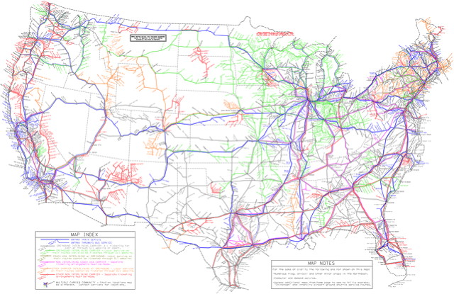
A Map of U.S. Intercity Bus and Train Routes
This map from the American Intercity Bus Riders Association (PDF) attempts to map every intercity bus and train route in the United States—i.e., everywhere you can go without a car. It’s a huge, high-resolution, detailed map, and I wouldn’t be surprised if they missed some. [Grist/GIS Lounge]
Two Detailed Rail Maps
A couple of supremely detailed rail maps to bring to your attention, both of which show every line and station of long-distance, regional and commuter rail networks. There’s one for California, which uses a Beck-like, diagrammatic design, and one for the Northeast Corridor (see above), which opts for geographic accuracy. Despite the differences there’s a lot of overlap on the two design teams. Creative Commons licensed, with printed posters available.