Map designer Max Roberts has designed subway maps for London and New York that are based on a series of concentric circles. Strictly for fun (and shock and horror), he says, but there’s an undeniable clarity to them. Via Kottke.
Month: July 2013
A Fantasy Map of Great Britain
It turns out that Samuel Fisher has also created a fantasy map of Great Britain, in addition to his Australian fantasy map and one version of the U.S. fantasy map. Again: an important data point for understanding what people think a fantasy map looks like. (His lettering is a dead ringer for Christopher Tolkien’s on the Middle-earth map.) Via Fuck Yeah Cartography.
A Fantasy Map of Australia
Like the fantasy map of the United States we saw last year, Samuel Fisher’s fantasy map of Australia is relevant to my interests because it shows what people think a fantasy map should look like—how it should be styled, what elements it should contain, and so forth. In this case, oblique mountains and forests drawn as stands of individual trees make their usual appearance; the labels are hand-drawn; and the colour scheme runs from cream to taupe. Via Maps on the Web.
Smoke and Smog
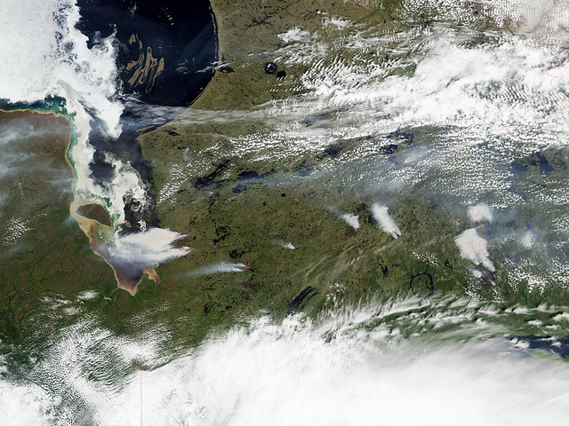
Forest fires near Eastmain, Quebec had a dramatic impact on air quality around here last week; I woke up hacking and wondering why. (Air filters to maximum!) The above photo, taken by the MODIS sensor aboard NASA’s Aqua satellite on June 28, gives some idea of the situation on the eastern shores of James Bay. (The photo also shows a brown-stained James Bay, the result of tannin-stained water from bogs spilling into the bay in spring.) Image credit: NASA Earth Observatory.


