ProPublica maps the change in California’s fire seasons. “As California continues battling its worst wildfire season on record, new research shows that fall fire weather days—days with high temperatures, low humidity and high wind speeds—will double in parts of the state by the end of the century and will increase 40% by 2065. […] In the north, a summer fire season has been driven by high temperatures and low humidity. In Southern California, fall fire season is driven by east winds. With climate change, though, both the summer and fall fire seasons have grown longer, and are melting into each other, overlapping in time and space.” [Joshua Stevens]
John Nelson’s 100 Years of Wildfire is a static map showing a century of California wildfires, simplified into zones of 100 square miles. The map measures the cumulative burn area for each zone over that entire time: this can exceed 100 or even 200 percent if large fires are frequent enough, or the whole damn area burns down more than once.
The California Fire Observatory combines longer-term data about forest cover with up-to-date information about wildfire hotspots and wind speed. “We map the drivers of wildfire hazard across the state—including forest structure, weather, topography & infrastructure—from space. […] By providing these data for free we hope to support the development of data-driven land management strategies that increase wildfire resilience—for forests and communities—enabling people and nature to thrive.” [Maps Mania]
NASA Earth Observatory has had several stories on the western U.S. wildfires, gathered here. This story summarizes the situation; satellite images of the smoke generated by the fires can be seen here, here and here.
Last year saw an uptick in fire activity in the Amazon basin. This year a new tool has been released that aims to help classify the fires being observed. The Amazon Dashboard classifies each fire as a deforestation fire, a savanna fire, a small clearing and agricultural fire, or an understory forest fire, and tracks whether the fire is in a protected or indigenous territory. NASA Earth Observatory:
The fire analysis tool is already bringing new clarity and insight to the 2020 fire season. In July, Brazil announced a 120-day ban on fires in the Amazon rainforest; it was presented as an effort to limit ecological damage from fires this year. However, the NASA-led fire analysis indicates that there has been a proliferation of fires in key deforestation hotspots in the southern Amazon states of Pará, Mato Grosso, and Amazonas.
Other raw data sources include the Copernicus Atmosphere Monitoring Service (CAMS), fire activity data from which can be viewed here; and MODIS data from NASA’s Terra and Aqua satellites. For a live feed of MODIS data on the Amazon fires, see the MODIS Wildfire Dashboard.
NASA
Meanwhile, NASA’s Earth Observatory posted MODIS imagery of several Amazon fires, and had this curious statement that seemed to minimize the scale of the problem: “As of August 16, 2019, an analysis of NASA satellite data indicated that total fire activity across the Amazon basin this year has been close to the average in comparison to the past 15 years. […] Though activity appears to be above average in the states of Amazonas and Rondônia, it has so far appeared below average in Mato Grosso and Pará, according to estimates from the Global Fire Emissions Database, a research project that compiles and analyzes NASA data.”
A subsequent NASA Earth Observatory post seems to contradict the one I mentioned earlier, pointing to “a noticeable increase in large, intense, and persistent fires burning along major roads in the central Brazilian Amazon” which “are more consistent with land clearing than with regional drought” and noted fire detections “higher across the Brazilian Amazon” since 2010.
Contextualizing the amount of fires seems to be a recurring theme in the reporting: the number of fires are up sharply over last year, but close to the average when taking a longer view. It’s helped a lot of bad and insincere actors make it harder to get to the heart of what’s going on over there. They can’t, after all, deny the satellite imagery or the remote sensing: we can see the fires. We can detect the emissions of smoke, carbon dioxide and carbon monoxide (1, 2, 3). We can map them. And those maps can help us understand what’s going on.
On the NGO front, InfoAmazonia has produced the above map comparing fires over the last 24 hours with historical fire data. (They have other maps on this subject as well.)
The highest and lowest ranked causes are highlighted when the chart loads. These represent the cumulative ranking across all years. Lightning, a natural cause, often floats to the top, but that’s only because on the human side, the vote is split between more than twenty options. Lightning doesn’t predominate in all states, though. In Alabama, the number one cause is pyromania. In Indiana, it’s brakeshoes. In Minnesota, it’s field burning. There are a couple of overall trends, too. Smoking is going down as a cause, and powerlines are going up.
Last October Robin Kraft posted an online map of the northern California wildfires showing satellite imagery from before and after the fires (see previous entry); today he’s posted a blog entry explaining how he built it, in great technical detail. The timing is not accidental: “There is another fire raging in Los Angeles right now — if DigitalGlobe and Planet release their data, you can use this guide to make your own map.”
Floods, fires, earthquakes, volcanoes, bombings, droughts, and even alien invasions: disaster can take many forms. And, although disasters are always felt dramatically, a disaster’s form and location impacts who records its effects and what forms those records take. “Where Disaster Strikes” investigates the intertwined categories of modern space and disaster through the Harvard Map Collection’s maps of large destructive events from the London Fire to the present.
Open to the public. The exhibition also has a substantial online presence.
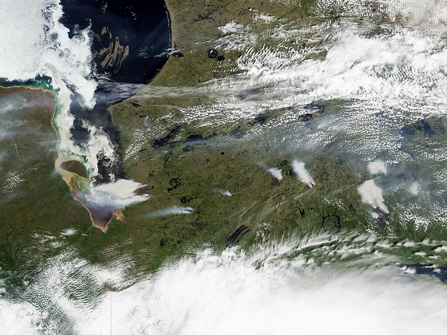
Forest fires near Eastmain, Quebec had a dramatic impact on air quality around here last week; I woke up hacking and wondering why. (Air filters to maximum!) The above photo, taken by the MODIS sensor aboard NASA’s Aqua satellite on June 28, gives some idea of the situation on the eastern shores of James Bay. (The photo also shows a brown-stained James Bay, the result of tannin-stained water from bogs spilling into the bay in spring.) Image credit: NASA Earth Observatory.


 Two maps:


 Sonoma County’s