Canada Maps the Arctic Seafloor

CBC News reports on the Canadian Coast Guard’s project to map the continental shelf under the Arctic Ocean, now in its third and final year. This is part of Canada’s attempt to stake a claim to the continental shelf (and seas above it) beyond the 200-mile nautical limit, which other Arctic countries (hello, Russia) are also trying to do.

Previously: Arctic Maritime Jurisdiction Map.

Canada’s Arctic Waters Are ‘Dangerously Unmapped’

Climate change has made the Arctic increasingly open to shipping, and more ships travel the Canadian Arctic every year. But as Claire Eamer argues in Hakai magazine, the lack of mapping makes such voyages a dangerous proposition. “[J]ust because the ice is melting it doesn’t mean the waterways are safe. The federal Canadian Hydrographic Service (CHS) is responsible for mapping Canada’s waters. So far, they’ve only managed to map roughly 10 percent of Arctic waterways in accordance with international standards.” [CCA]

Mapping Arctic Permafrost

permafrost

NASA Earth Observatory: “The map above, based on data provided by the National Snow and Ice Data Center, shows the extent of Arctic permafrost. Any rock or soil remaining at or below 0 degrees Celsius (32 degrees Fahrenheit) for two or more years is considered permafrost.” The map differentiates between continuous, discontinuous, sporadic and isolated permafrost. [NASA Earth]

Map of Canada Changes Depiction of Arctic Sea Ice

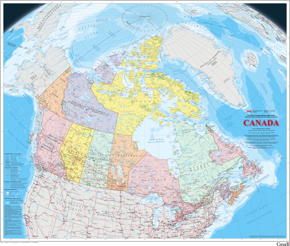
Map of Canada

The federal government’s new map of Canada, part of the Atlas of Canada reference series, came out this week. Among the changes between it and its predecessor (which came out in 2006), one in particular is drawing attention. Ivan Semeniuk in the Globe and Mail:

Whereas the older version of the map showed only that part of the sea ice that permanently covered Arctic waters year round at that time, the new edition uses a 30-year median of September sea-ice extent from 1981 through 2010. September sea ice hit a record low in 2012 and is projected to decline further. The change means there is far more ice shown on the 2015 version of the map than on its predecessor.

The changes can be seen below: the 2006 map is on the left, the 2015 map on the right.

Differences in sea ice between 2006 and 2015 maps of Canada

Now as Semeniuk’s piece points out, neither way is wrong. But all maps have a point of view, and it’s naive to think that this change was made in a value-neutral environment: this was the result of a conscious decision. The reason for that decision—that’s what’s interesting.