Tube Map Adds Thameslink Stations, Becomes More Even Complicated

The new temporary Tube map
Transport for London

Complaints that London’s Tube map has gotten too complicated are not new. So it’s not too surprising that Transport for London’s decision to add Thameslink rail services to the Tube map as of next month—temporarily, as a means of illustrating alternative travel options in the age of social distancing—is generating some heat. Thameslink already appears on TfL’s Tube and Rail map, but adding it to the Tube map proper is in some quarters seen as the final straw. Jonn Elledge at On London:

Once a design classic, the map has been ugly, and getting uglier, for a while. The rot started to set in with the baffling decision to show the fare zones using a series of irregular grey polygons that make it look like the familiar shape of the Tube network had been painted against the backdrop of the sort of artwork you’d find lining the corridors of a Gatwick Airport hotel sometime in the late 1980s.

But the bigger problem is that Transport for London have thrown more and more services onto the map without any apparent consideration for what it might need to change in order to accommodate them. Most of the map is still given over to the northern half of London, even though a growing share of the services it shows (the Overground, Tramlink, now Thameslink) are south of the river.

Diamond Geezer has some specific questions about what the map is doing. On YouTube, Geoff Marshall is more positive.

The new map isn’t up on the TfL site yet, but can be seen here.

Previously: Has the Tube Map Become Too Complicated?

Transport for London’s Historical Archive of Car Line Diagrams

Bakerloo Line CLDs (Transport for London)

IanVisits has stumbled across Transport for London’s cache of car line diagrams (CLDs)—the linear maps that appear inside each train car. The TfL page includes CLDs ands CLD stickers for all lines going back to 1996; each line has its own PDF file that contains every iteration of its diagram, one per page. “No one will care about this whatsoever,” says IanVisits. IanVisits is, I suspect, wrong. [WMS]

Tube Maps of the Thames

Transport for London also operates river buses along the Thames; their maps of the London River Services are very much in the Tube map vein, in both tourist and non-tourist versions:

Of the tourist version Ollie O’Brien of Mapping London says this: “We like the pseudo-tube-map styling, although it could of course be simplified even further, with the Thames just being shown as a straight line. The inclusion of isometric squares showing the major landmarks near each pier is a nice touch. TfL has never really decided whether its river services are for tourists or commuters, but this map should satisfy both.”

Tube Maps with Walking Distances

steps-tube-map

The Tube map, like other diagrammatic transit network maps, does not show distances between stations very well: two adjacent stations on the map could be right on top of each other or miles apart. Last November Transport for London released a map showing walking times between each station (PDF); news stories at the time connected it to imminent strikes by Tube workers. Now they’ve released another walking map, this one showing the number of steps between each station (PDF), which is presumably mainly of interest to people with activity trackers (pedometers, fitness bands and smart watches) that count their steps. News coverage from the Daily Standard. [Map Makers]

INAT London Metro Map

inat-london

Jug Cerović has reimagined the map of London’s transit network. It’s one of several transit maps that share a common design languageMapping London calls it “a lovely map of the London system that manages to combine the tube and commuter rail networks into a single map that is clear and pleasant to read, unlike the official ones. The INAT London Metro Map is a lesson in simplifying and making attractive a complex topological map.” Though I think the rhetoric about moving away from Beck is a bit overdone—it’s not like we’re completely abandoning diagrammatic map design here.

Previously: A Geographically Accurate Tube Map.

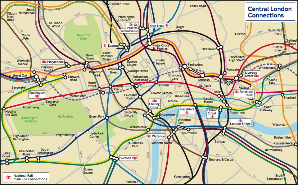
A Geographically Accurate Tube Map

London Connections map (detail)

There is no transit map more iconic than the London Underground’s Tube map. First created by Harry Beck in the 1930s, the design has inspired countless other transit network maps that are schematic diagrams rather than geographically accurate maps. But Transport for London, which operates the Underground, also has a geographically accurate map of the network: it was strictly for internal use, but a freedom of information request has now brought it to light. It’s available here (PDF). The response has been so good that TfL now says it’ll be added to their website. CityMetric, Mapping London.