London Underground Architecture and Design Map

Blue Crow Media’s latest map of urban architecture is the London Underground Architecture and Design Map, a collaboration between transit system guru (and friend of The Map Room) Mark Ovenden and photographer Will Scott. “The guide includes a geographical Underground map with featured stations marked, with corresponding photography and details on the reverse along with tips for where to find unique and unusual signage, roundels, clocks, murals and more. The map is protected by a slipcover featuring a distinctive die cut roundel.” Costs £9. More at Mapping London.

Previously: Architectural Maps of London.

Roman Roads, Subway Style

Sasha Trubetskoy

There are a lot of Tube map-inspired maps of non-Tube map things out there, and not all of them are worth mentioning. This one, however, is: Sasha Trubetskoy’s map of the major roads of the Roman Empire in the year 125, done up like a subway diagram, colour-coded by name (both real, where available, and “creatively invented,” where not) and with all text in Latin.

Tube Maps of the Thames

Transport for London also operates river buses along the Thames; their maps of the London River Services are very much in the Tube map vein, in both tourist and non-tourist versions:

Of the tourist version Ollie O’Brien of Mapping London says this: “We like the pseudo-tube-map styling, although it could of course be simplified even further, with the Thames just being shown as a straight line. The inclusion of isometric squares showing the major landmarks near each pier is a nice touch. TfL has never really decided whether its river services are for tourists or commuters, but this map should satisfy both.”

A Tube Map of Roman London

A thing from 2015 that I hadn’t seen until recently: Londonist’s Tube Map of Roman London. “Stations indicate sites of major Roman landmarks, such as gates in the wall, municipal buildings and temples. Nobody knows what the Romans called their creations, so we’ve used the modern names, like Ludgate and Bishopsgate, which are medieval in origin. Stations in bold indicate locations where Roman remains are still accessible to the public.” [Londonist]

An Error-Ridden Tube Map Shower Curtain

Speaking of Londonist, they had a great deal of fun pedantically savaging a decidedly unofficial tube map shower curtain. “This error-ridden shower curtain was purchased via a random seller on ebay, whom we’re not going to gratify with a link. A bit of googling reveals that tube shower curtains are a bit of a thing. There are many variations out there, all presumably knocked together and marketed without permission from Transport for London.” (So much of a thing that I thought I’d linked to something like this before, but apparently not. No doubt my readers can send me links.)

Previously: Map Shower Curtain and Bikini; More Map Shower Curtains; Sea Monster Shower Curtain.

End of the Line: A Tube Map of Tube Maps

Well, this is meta. Kenneth Field, whose map of Mars I told you about earlier this year, has created a tube map of tube maps.

End of the Line is an attempt to be the last word in tube map pastiche. […]

While Beck himself likely ‘copied’ a number of aspects that ended up on his map he did so with consummate skill to create something unique, innovative and functional. Most subsequent schematic maps are pale imitations. We wrote a semi-academic paper about it which you can access from my blog here.

All too often we see transit map templates used as a short-cut to recognition and success. With no hint of irony whatsoever (!) we’ve done exactly the same and mapped the weird and wonderful world of Becksploited maps onto some tube lines and stations.

Becksploitation. There’s a term for you. It’s not like there’s no use for it.

A Map of the London Underground Track Network

london-tube-track

A freedom of information request sent to Transport for London in 2013 turned up this 2009 map of the London Underground’s track network (17.1 MB PDF)—complete with sidings, switches and yards. Among other things, you can see how a train can cross from one line to another. CityMetric picked up the story last week and it’s gone seriously viral since then: Boing Boing, JalopnikWired.

If this is the sort of thing that fascinates you, you should go look at Franklin Jarrier’s maps of urban rail networks (which I told you about in 2011). These aren’t official maps, but they do for many systems around the world what the map above does for the Tube.

Tube Maps with Walking Distances

steps-tube-map

The Tube map, like other diagrammatic transit network maps, does not show distances between stations very well: two adjacent stations on the map could be right on top of each other or miles apart. Last November Transport for London released a map showing walking times between each station (PDF); news stories at the time connected it to imminent strikes by Tube workers. Now they’ve released another walking map, this one showing the number of steps between each station (PDF), which is presumably mainly of interest to people with activity trackers (pedometers, fitness bands and smart watches) that count their steps. News coverage from the Daily Standard. [Map Makers]

Redrawing the London Tube Map

Back to Beck Tube Map

Designer Cameron Booth wondered whether London’s Tube Map could simply be drawn better. “There’s no doubt in my mind that the current iteration of the Tube Map is a diagram that’s almost completely forgotten that it is one. There’s very little rhythm, balance or flow to the composition of the map outside the central ‘thermos flask’, and there’s shockingly little use of a underlying unifying grid. As a result, nothing really aligns properly with anything else anymore.” His solution included getting rid of fare zones, redrawing accessibility icons, rejigging alignments, and lots of other changes. Read his post and his follow-up post for the end result (or results: he’s continuing to refine the map).

Previously: INAT London Metro MapA Geographically Accurate Tube Map.

INAT London Metro Map

inat-london

Jug Cerović has reimagined the map of London’s transit network. It’s one of several transit maps that share a common design languageMapping London calls it “a lovely map of the London system that manages to combine the tube and commuter rail networks into a single map that is clear and pleasant to read, unlike the official ones. The INAT London Metro Map is a lesson in simplifying and making attractive a complex topological map.” Though I think the rhetoric about moving away from Beck is a bit overdone—it’s not like we’re completely abandoning diagrammatic map design here.

Previously: A Geographically Accurate Tube Map.

A Geographically Accurate Tube Map

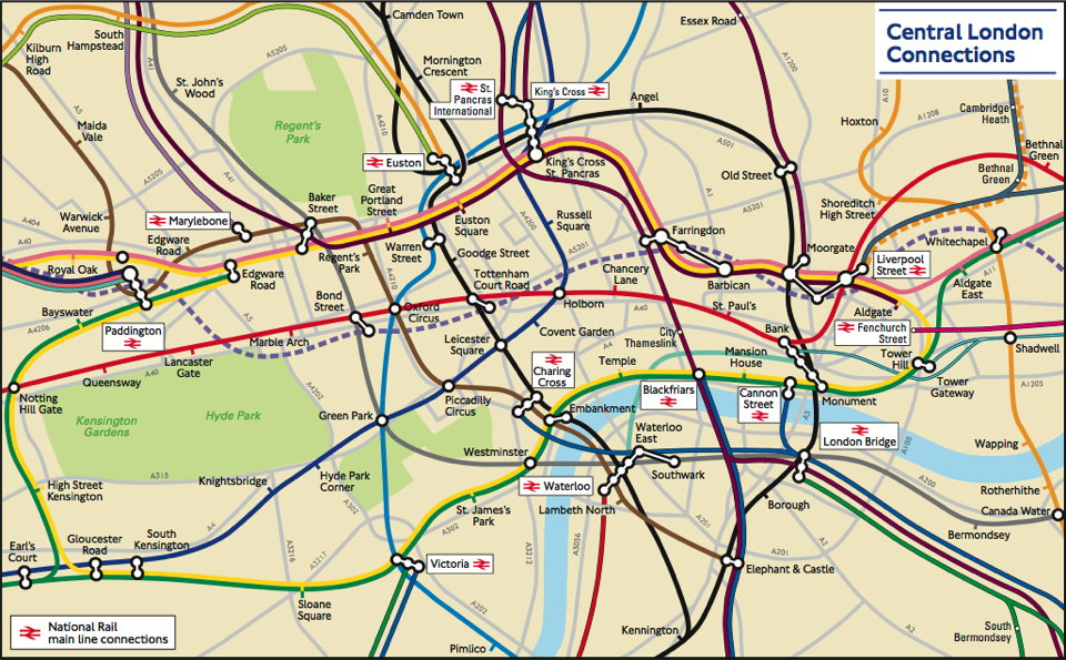
London Connections map (detail)

There is no transit map more iconic than the London Underground’s Tube map. First created by Harry Beck in the 1930s, the design has inspired countless other transit network maps that are schematic diagrams rather than geographically accurate maps. But Transport for London, which operates the Underground, also has a geographically accurate map of the network: it was strictly for internal use, but a freedom of information request has now brought it to light. It’s available here (PDF). The response has been so good that TfL now says it’ll be added to their website. CityMetric, Mapping London.