Apple Maps Data Being Completely Rebuilt for iOS 12

TechCrunch’s Matthew Panzarino reported last week on major changes coming to Apple Maps in iOS 12. The underlying data, which has come in for criticism since the service launched, is being redone. Rather than relying on “a patchwork of data partners,” Apple is growing its own map data.

It’s doing this by using first-party data gathered by iPhones with a privacy-first methodology and its own fleet of cars packed with sensors and cameras. The new product will launch in San Francisco and the Bay Area with the next iOS 12 beta and will cover Northern California by fall.

Every version of iOS will get the updated maps eventually, and they will be more responsive to changes in roadways and construction, more visually rich depending on the specific context they’re viewed in and feature more detailed ground cover, foliage, pools, pedestrian pathways and more.

This is nothing less than a full re-set of Maps and it’s been four years in the making, which is when Apple began to develop its new data-gathering systems. Eventually, Apple will no longer rely on third-party data to provide the basis for its maps, which has been one of its major pitfalls from the beginning.

Well worth a read if you’re interested in mobile maps: Panzarino’s article digs down into how Apple will collect and process its mapping data. how it plans to dramatically speed up changes and updates to the map, and how (it says) it’s taking privacy seriously at every step of the process.

Third-Party Map Apps Coming to CarPlay in iOS 12

As of iOS 12, coming later this year, CarPlay will support third-party map applications like Google Maps and Waze, Apple announced during its WWDC keynote earlier today: AppleInsider, Engadget, The Verge. Up until now the only maps available via CarPlay were Apple’s own; drivers who would rather use something else—and I know lots of them are out there—will soon have that option.

The Rumsey Collection’s Augmented Reality Globe App

The David Rumsey Map Collection has a number of virtual globes, but its AR Globe app may be the most unusual way to view them. Released last December for the iPhone and iPad, it uses augmented reality to superimpose one of seven celestial or terrestrial globes from the 15th through 19th centuries. The globes can be manipulated—spun, zoomed in and out—or observed from the inside (which is a good thing with celestial globes).

To be honest I’m not sold on using augmented reality to view virtual globes. It’s one thing to use AR to superimpose IKEA furniture in your living room: that makes sense, because it helps you visualize where the furniture would go and what it would look like. But it’s hard to see the utility of plunking a virtual globe in your living room: what’s the point of adding your surroundings as a backdrop? Case in point:

It’s neat but not particularly useful, is what I’m saying.

Google Maps Abandons Experimental Calorie Counter

An experimental feature in the iPhone version of Google Maps that measured the calories burned (and equivalent in mini-cupcakes) when walking a route instead has been pulled due to complaints, TechCrunch reports: the feature couldn’t be disabled, the calorie counts were vague and unhelpful, and it could be actively harmful to users with eating disorders. More at BuzzfeedSlate and The Verge.

Augmented Reality Comes to OS Maps

The Ordnance Survey’s OS Maps mobile app now has a new augmented reality mode. “Using the phone or tablet’s camera view, hills, mountains, coastal features, lakes, settlements, transport hubs and woodland in the vicinity are identified and labelled. If a label is pressed and there is a data connection, a page of useful information about that location is displayed, including nearby walks, photos and places to stay.” AR is very neat but battery-intensive; nevertheless this strikes me as a very useful application of the technology. [iOS App Store, Google Play]

How the Transit App Got Its Curves

transit-appThe makers of the Transit app (iPhone, Androidlike to point out that whereas Apple’s transit maps are beautiful but basically hand-drawn and added manually and slowly, and Google’s maps are algorithmically generated but look terrible, their maps are algorithmically generated but look smooth and neat. A technical post by their backend developer explains in ridiculous detail how they managed to auto-generate their smooth, curved transit network maps.

Maps in iOS 10

I’ve just upgraded my iPhone and iPad to iOS 10, but haven’t had a chance to mess with the new version of Apple Maps; iMore and Macworld set out the changes, including integrated services and apps, predictive intelligence, and improvements in driving directions and search, among other things. Also, you can set it to remember where you parked, which isn’t new in and of itself, but is for iOS.

“We made significant changes to all of our development processes because of it,” says Cue, who now oversees Maps. “To all of us living in Cupertino, the maps for here were pretty darn good. Right? So [the problem] wasn’t obvious to us. We were never able to take it out to a large number of users to get that feedback. Now we do.”

Apple senior vice president Eddie Cue, quoted in this Fast Company profile of Apple, on how the Apple Maps debacle changed Apple’s famously insular culture, opening things up to the point that they now have a public beta program. [James Fee]

A Preview of Maps in iOS 10

iLounge’s Jesse Hollington looks at the changes coming to Maps in iOS 10, the next release of Apple’s operating system for the iPhone and iPad. “Functionally, it doesn’t quite incorporate the kind of sweeping changes we’ve seen in prior years, but instead focuses on redesigning the user experience and adding a few useful iterative features.” (Thanks to James Fee for the link.)

Greater London A-Z Street Map

greater-azIt shouldn’t surprise me that there’s a mobile version of the London A-Z Street Atlas. There are, in fact, several, the most recent of which is the Greater London A-Z Street Map, which covers some 3,743 km2 of territory and stores all its maps—the same maps you’d get in the paper edition—on the device. (Which makes it a fairly significant download: 603 MB on iOS, 382 MB on Android.) The iOS version costs £5 and is compatible with both the iPhone and iPad. The Android version is available on Google Play and costs about the same.

Tube Map Live

Tube Map Live icon Andy Drizen’s Tube Map Live (iTunes), a free iOS app (native iPhone and iPad versions) that shows the real-time positions of London Underground trains on the iconic Tube map, using official data. Hypnotic visualization, but the app essentially promotes Drizen’s £1.99/$2.99 Tube Tracker: tapping on trains or stations calls up an advertising popup. Via TUAW.

The KickMap Comes to London

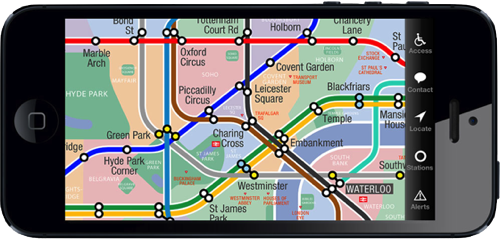
KickMap London screenshot

In 2007 Eddie Jabbour released the KickMap, a map of the New York subway system that tried to square the circle of various competing and controversial New York subway map designs. The KickMap later became an iOS app; I reviewed the iPad version in 2010. Now Eddie reports that he’s released a KickMap for the London Underground—not satisfied with updating Massimo Vignelli, he’s going after Harry Beck.

[W]hile the Tube Map’s updates over the decades have attempted to follow Beck’s design, a glance at the current iteration reveals that his design heirs have failed to retain his core credo of clarity and ease of use. Ongoing expansion of the Underground, the addition of the new Overground system, and essential disability access information have made most modern Tube Maps, both official and independent, overly complex and difficult to read. … [I]nstead of redesigning the entire map vocabulary as we did for KickMap NYC, we embarked on a fresh new effort to recapture Beck’s clarity and ease of use.

A regular Underground user would be able to evaluate whether the map succeeds in its goal to improve the Tube map’s clarity; I haven’t even so much as been to London, much less taken the Tube. But I’ve downloaded the app (disclosure: I received a promo code) and have played around with it a bit.

What I can say is that the map is gorgeous and scrolls fluidly (at least on an iPhone 5). In a nice touch, it adds detail like neighbourhoods and landmarks only when zoomed in, preserving a simpler, less cluttered map when zoomed out.

Those of you who’ve used the New York KickMap will find much that is familiar. While it can use your iPhone’s GPS to locate the nearest station—a nice touch on a non-geographic map—it does lack the New York app’s Directions function, which can route you between two stations on the network. Something to ask for, I think, in an update.

It costs only £0.69/$0.99 and is a universal iPhone/iPad app. iTunes link.