Architectural Maps of London

dsc_3492

London-based publisher Blue Crow Media has begun issuing a series of cartographic guides to urban architecture. They sent me samples of their first two maps, the Art Deco London Map and the Brutalist London Map. (A bilingual Constructivist Moscow Map came out this week, and a Brutalist Washington Map is coming in October.)

Each is a folded paper map of London, 42 × 60 cm in size, that highlights more than 50 examples of Art Deco or Brutalist architecture, respectively, found in that city. On the front side is the map itself, where the architectural examples, highlighted in red, pop out against an extremely spare base layer that has no text except for parks and Tube stations; streets are unlabelled. The end result is dramatic and clear—the grey-on-black Art Deco map is particularly striking—but presupposes a familiarity with the landscape (or a smartphone); these maps really can’t be used on their own to find things. They’d look awfully good on a wall, though. These are simple, well-designed maps that make a virtue of simplicity. They cost £8 each (or two for £14.50).

Vintage Map Postcards and Stickers

cavallini-tins

Cavallini and Company is a stationery and gifts company that uses vintage imagery from the 19th and 20th centuries in its products, including botanical drawings, travel posters—and maps. There are map calendars, file folders, pencil cases, notebooks, magnets and wrapping papers, among many other items. You’ll often find them in stationery and map stores.

This month I decided to participate (at least a little) in A Month of Letters, and for that I needed to restock my stationery supply. Since I’m known to have a thing about maps, I figured I’d try out two of Cavallini’s products: their vintage map postcards and their vintage map stickers. Both come in metal tins that feel retro in and of themselves.

Continue reading “Vintage Map Postcards and Stickers”

Review: Barrington Atlas iPad App

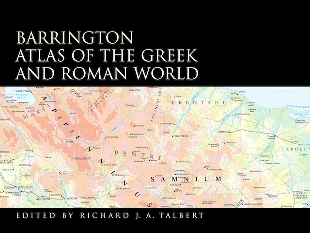
Barrington Atlas of the Greek and Roman World (screenshot)

The Barrington Atlas of the Greek and Roman World was a landmark in historical cartography: an atlas that pinpointed locations from classical antiquity on modern maps. The result of more than a decade’s work and $4.5 million in funding support (here’s the project website), the print version of the Barrington Atlas, which came out in 2000, was both enormous and expensive: larger than either the National Geographic or Times Comprehensive atlases,1 and priced at an eye-popping $395.

Now, as I mentioned earlier, there’s an iPad version of the Barrington Atlas, which (they say) contains the full content of the $395 print atlas and costs only $20 (iTunes link). On that basis it’s a no-brainer: $20 is better than $395. (95 percent off!) Classicists with iPads who don’t buy this app have something wrong with them. But how does it work as a map app?

Continue reading “Review: Barrington Atlas iPad App”

The KickMap Comes to London

KickMap London screenshot

In 2007 Eddie Jabbour released the KickMap, a map of the New York subway system that tried to square the circle of various competing and controversial New York subway map designs. The KickMap later became an iOS app; I reviewed the iPad version in 2010. Now Eddie reports that he’s released a KickMap for the London Underground—not satisfied with updating Massimo Vignelli, he’s going after Harry Beck.

[W]hile the Tube Map’s updates over the decades have attempted to follow Beck’s design, a glance at the current iteration reveals that his design heirs have failed to retain his core credo of clarity and ease of use. Ongoing expansion of the Underground, the addition of the new Overground system, and essential disability access information have made most modern Tube Maps, both official and independent, overly complex and difficult to read. … [I]nstead of redesigning the entire map vocabulary as we did for KickMap NYC, we embarked on a fresh new effort to recapture Beck’s clarity and ease of use.

A regular Underground user would be able to evaluate whether the map succeeds in its goal to improve the Tube map’s clarity; I haven’t even so much as been to London, much less taken the Tube. But I’ve downloaded the app (disclosure: I received a promo code) and have played around with it a bit.

What I can say is that the map is gorgeous and scrolls fluidly (at least on an iPhone 5). In a nice touch, it adds detail like neighbourhoods and landmarks only when zoomed in, preserving a simpler, less cluttered map when zoomed out.

Those of you who’ve used the New York KickMap will find much that is familiar. While it can use your iPhone’s GPS to locate the nearest station—a nice touch on a non-geographic map—it does lack the New York app’s Directions function, which can route you between two stations on the network. Something to ask for, I think, in an update.

It costs only £0.69/$0.99 and is a universal iPhone/iPad app. iTunes link.

Review: The Lands of Ice and Fire

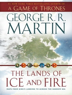
The Lands of Ice and Fire (cover) The Lands of Ice and Fire, which came out last month, is a collection of maps of the lands of George R. R. Martin’s Song of Ice and Fire series, executed by the fantasy cartographer Jonathan Roberts.

You should know what you’re getting when you buy this. It’s not an atlas. It’s not even a book. George himself describes it as “a book-shaped box containing a whole bunch of gorgeous, glossy, fold-out maps of Westeros, Essos, and the lands and seas from A Song of Ice and Fire.” There is no text other than on a single-page introduction.

Open the box and you see two sleeves containing six maps apiece. Each map is 24 by 30 inches, single sided, in full colour, and on glossy paper, the kind you can see your fingerprints on. As fantasy maps go, this is a lavish production—a long way from the two-colour atlases we’ve seen for other imaginary worlds. (Some Amazon reviewers have expressed concern about wear and tear from folding and unfolding the maps; bear that in mind.)

Continue reading “Review: The Lands of Ice and Fire”

Nokia’s Here Maps App

Earlier this month Nokia, the parent company of Navteq, announced its cross-platform mapping service, which they’re calling Here. To that end, its free iOS app, Here Maps, appeared in the App Store this week. I’ve poked around with it a little bit today and have some thoughts.

Those seeking a true alternative to Apple’s (or Google’s) maps will probably be disappointed. It’s a perfectly serviceable portal to the Nokia’s map platform, but there’s nothing to ooh or aah over. Nokia’s maps aren’t necessarily better; as with all map platforms—Google’s, Apple’s, OpenStreetMap’s and Nokia’s—whose is better varies from place to place. For my little village, for example, Nokia’s street data is a bit better than Apple’s, and it has more POIs; on the other hand, some of Nokia’s POIs are misplaced, and Apple has better, higher-resolution imagery for my area. Again, it depends on where you are.

I’m not a fan of Here Maps’s UI: it’s rather clunky and appears to be designed to be the same across all platforms, rather than using native iOS widgetry. It seems better matched to the iPhone/iPod touch than to the iPad, where the non-native popup windows swallow too much of the screen. The map tiles are bitmapped rather than vector images, and load more slowly than I’d expect. To be sure, there is an offline mode, and a few other features I haven’t explored yet—see Cult of Mac, Macworld and TUAW for more thorough looks at this app. My first impression is kind of meh: it’s good to have multiple map apps, but this one doesn’t really stand out. But it’s free, so it can’t hurt to try it.