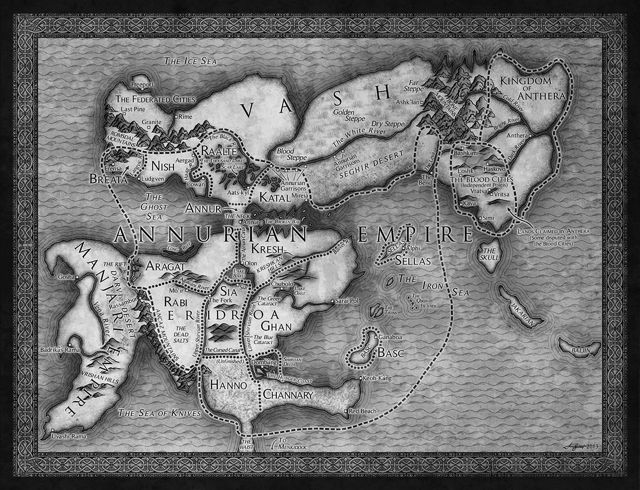
So today Tor.com posted something very much relevant to my interests: a piece by illustrator Isaac Stewart that describes his process for creating a map for a fantasy novel. In this case, The Emperor’s Blades by Brian Staveley, who very helpfully provided a sketch from which Stewart could work.
This is utterly fascinating for me, because a significant gap in my research into fantasy maps has been the process of creating them. It’s sort of left me feeling like a wine taster that has no idea how wine is made. Stewart (who has also done work for Brandon Sanderson’s novels: his maps for The Alloy of Law have already caught my attention) takes us through every step, from inspiration through Photoshop.
Earlier this year I published an article pointing out that the main difference between historical and fantasy maps was information density: a real medieval map is full of detail, because cartographers don’t dare waste vellum; fantasy maps are relatively sparse—largely, I suspected, because only so much detail can legibly fit on a map printed for a mass-market paperback. That was an educated guess on my part; it’s interesting to see it confirmed:
A map meant to fit in a hardcover book (and subsequently a paperback) can’t be as detailed as a real-world map and still be legible. Even though I treat the map as a product of its fantasy world, it has to be understandable to modern audiences. Usually this means I can’t copy the exact style of my reference, but I can use it for inspiration.
I’ll be referring to Stewart’s post often, I think.
 If somebody who was vaguely interested in maps wanted a book to get them started, I think I might point them toward A History of the World in Twelve Maps, written by Renaissance Studies professor Jerry Brotton. This book first appeared in September 2012 in Great Britain, where it’s now out in paperback. The U.S. edition came out last month in hardcover.


