Paul Schenk’s Atlas of the Galilean Satellites (Cambridge University Press, 2010) collects all the imagery gathered by the Voyager and Galileo missions of the four major moons of Jupiter (Callisto, Ganymede, Europa and Io, all discovered by Galileo in 1610) and assembles them into global, quadrangle and area maps. But this heavy, 400-page tome begins with a confession. “This Atlas is not what it should be.” The failure of the high-gain antenna on the Galileo spacecraft meant that far less data could be transmitted back to Earth during its nearly eight-year mission than had been planned. Large tracts of the moons are mapped in low resolution; the fuzzy images yield little detail. But until another mission is sent—the Juno probe now en route to Jupiter will not be studying the moons—this is all there will be for the foreseeable future. For decades, in fact.
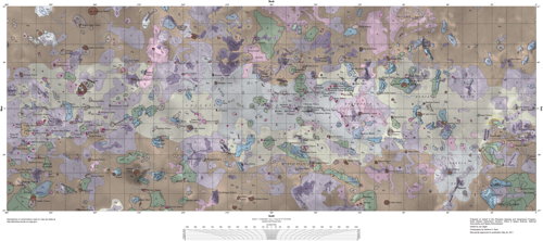
The Atlas of the Galilean Satellites therefore represents a treasure trove of all available imagery of these four moons. The further out you go, the less imagery there is: outermost Callisto gets 49 pages of plates, innermost Io, with all its interesting volcanoes, gets 89. Despite the inevitable blurry patches, there are some extraordinarily high-detail images here. One problem, though, is that the global maps are unlabelled; I found it difficult to place features that were labelled on the quadrangle, regional and detail maps in their global context. Also worth noting is that—and I suspect this is the norm for extraterrestrial mapping—these are not maps per se, but spacecraft imagery labelled and put on a map projection.
One issue that has been noted elsewhere—for example, in Emily Lakdawalla’s review last November—is that several copies of this book have been defective, with pages falling out. My own copy is fine, but seems a bit fragile. (UPDATE: Laying it open flat once was enough for several pages to come loose.) The signatures appear to be glued rather than sewn—a textbook example of the badly built British book—which is inexplicable given the size of the book and weight of the glossy paper, to say nothing of its cost. Because, at $165 (£95) list, this book is extremely expensive; ebook versions are just as exorbitant. Cheaper copies can be found elsewhere with a little digging: I got mine via AbeBooks for less than $30, shipping included. Honestly, given the risk of the book falling apart on you, that’s the way to go.
This atlas isn’t really aimed at beginners or people with a casual interest in the solar system. The price reflects that, as does its rather technical nature and organization. Those with a serious jones for the solar system will not be deterred by these or any other reservations.
Previously: Blogs and a Book About Maps of the Solar System’s Moons.
Amazon | iBooks