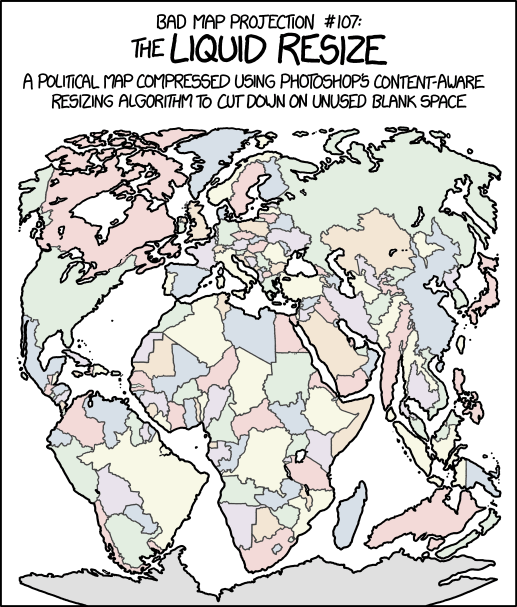
Every so often Randall Monroe puts up a map-related xkcd cartoon, and each time I dutifully post about it. This morning’s is called “Bad Map Projection: Liquid Resize.” Or: when Photoshop algorithms attack.

Every so often Randall Monroe puts up a map-related xkcd cartoon, and each time I dutifully post about it. This morning’s is called “Bad Map Projection: Liquid Resize.” Or: when Photoshop algorithms attack.

An exhibition of Sohei Nishino’s work is taking place right now at SFMOMA, the San Francisco Museum of Modern Art. In his Diorama Map series, Nishino assembles patchwork-quilt aerial views of cities from thousands of his photographs; each city is thrown deep into its own uncanny valley. Here’s an Atlas Obscura profile

Writing for the Portland Press-Herald, Colin Woodard compares the 2016 presidential election results to the eleven regional cultures he sets out in his 2011 book, American Nations. “The bottom line: the 2016 presidential election results exhibited the same regional patterning we’ve seen in virtually all competitive contests in our history, including those in 2008 and 2012. But by running on an unconventional platform, Donald Trump was able to erode his rival’s margins in certain nations.” He did better enough in rural Yankeedom and the Midlands to deny Clinton the victory in states she could not afford to lose. With plenty of maps to show the swing from the 2008 and 2012 votes. [Cartophilia]
Previously: Electoral Map What-Ifs.

An exhibition opening this week at the Jane Lombard Gallery in Manhattan features, among others, the work of Christine Gedeon, an artist who “uses a sewing machine, fabric and paint on raw canvas to create improvisational stitched ‘plots’ that toe the line between abstraction and landscape. Examining issues of the urban environment, cartography, and urban planning, Gedeon investigates how humans interact with each other and our built environment to form relationships, narratives, and identities.” Examples of Gedeon’s stitched work can be found at her website.

Official highway maps—paper highway maps—are still a thing: the Norfolk Virginian-Pilot has a profile of the Virginia Department of Transportation’s sole cartographer, Dwayne Altice, who’s responsible for the biennial updates to that state’s official transportation map. Includes some interesting behind-the-scenes detail about how the map is made—and how it used to be made (layers and layers of film). [WMS]
Last November art historian James Welu gave a talk at the Leventhal Map Center about Jan Vermeer’s use of maps in his paintings. The talk is now available on YouTube. I found it fascinating that Vermeer represented actual maps in his paintings — many of which are now very scarce or available only fragmentarily. [Leventhal Map Center]
The U.S. military uses a huge floor map of Washington, D.C. to plan for presidential inaugurations, as the Tech Insider video above shows. According to this, it’s used by the Armed Forces Inaugural Committee, a joint-service organization that provides military ceremonial support. (See this U.S. Army article from 2012 about the 2013 inauguration, and this 2008 Pruned blog post about the 2009 inauguration.) [Tim Wallace]
 Günter Schilder’s Early Dutch Maritime Cartography: The North Holland School of Cartography (c. 1580-c. 1620) comes out this month from Brill; its book launch takes place in Amsterdam on 27 January. [Tony Campbell]
Also scheduled for publication later this month: Mapping the Holy Land: The Origins of Cartography in Palestine by Bruno Schelhaas, Jutta Faehndrich and Halim Goren (I. B. Tauris).
Geographical magazine has reviews of two books I’ve mentioned here. Paul Presley reviews Treasures of the Map Room, which I reviewed here last month; and Laura Cole reviews Cheshire and Uberti’s Where the Animals Go, which I told you about last November.
The Map Books of 2017 page is now live; I’ll be adding books scheduled to be published during the year as I find out about them.
Caitlin at Geo Lounge on pantographs: “Before the use of computers to replicate and manipulate maps, a pantograph was one of the ways used to either reduce or enlarge the size of a map while reproducing an accurate copy of the original map.” I did not know about pantographs—they seem to have been widely used in drawing and diagramming. Maps too, it would seem.