The CIA also has a Flickr account, where they’ve posted a number of their maps in various albums sorted by decade (all of which are labelled “Cartography Maps,” which sounds dumb until you realize they probably mean Cartography Center Maps). I think the Cartography Tools album is even more interesting than the maps.
Edward Brooke-Hitching’s new book, The Phantom Atlas: The Greatest Myths, Lies and Blunders on Maps (Simon & Schuster UK, November) is a book about fictitious and erroneous places that were presented on maps as real—“non-existent islands, invented mountain ranges, mythical civilisations and other fictitious geography.” Places like the Mountains of Kong, or the open ocean at the North Pole, or California as an island. Both the Economist’s 1843 Magazineand the Guardian have excerpts and examples from the book.
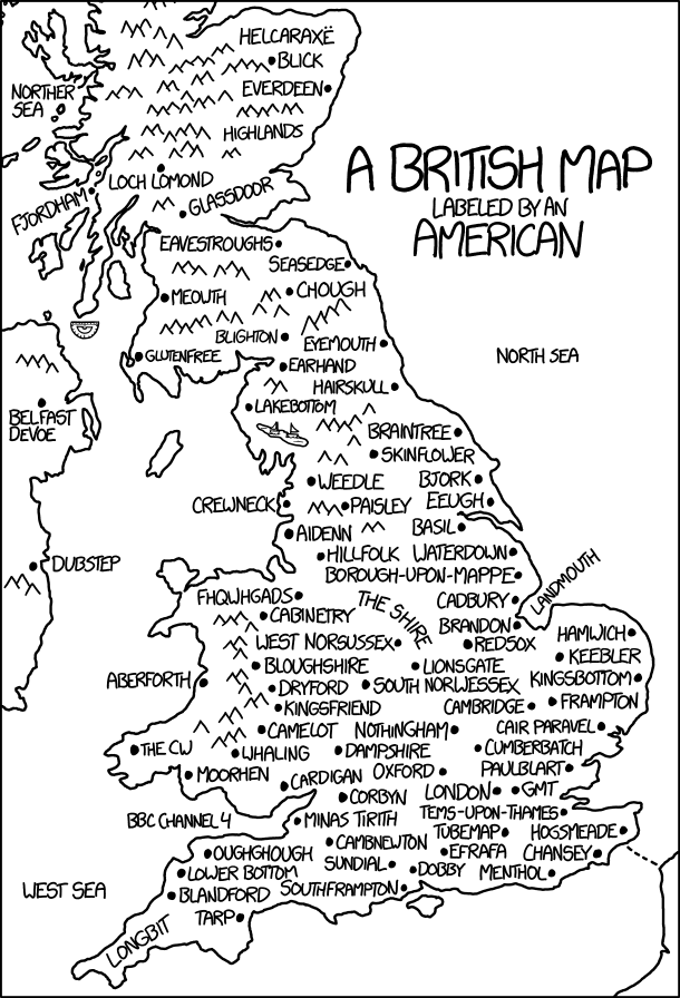
Today’s xkcd is a British map labelled by an American. It’s another one of those where the longer you stare at it, the more it hurts. Randall’s messing with us again.
Fantasy maps increased in number during the 20th century due to the rise of science fiction and fantasy writing, and the birth of television and video games.
Many of them are products of the wildest imaginations, and are immersive places of escapism. Yet all of them retain vestiges of the ‘real’ world in which they were created—whether because of a particular feature illustrated in it, the way in which it has been drawn, or even the ‘real-world’ contexts which inspired it.
Harper’s examples aren’t what someone well-versed in fantasy fiction would expect: they include Milne and Tolkien, but also Sleigh’s 1918 map of Fairyland (above), San Serriffe, and other maps of the unreal from outside genre fiction. (A reminder that fantasy map does not only mean map accompanying a secondary-world fantasy novel in the Tolkien tradition.)
The Spectator reviews Malachy Tallack’s new book, The Un-Discovered Islands. “This book is an account of 24 non-existent islands, yet is suffused with the same elegiac frostiness as before. Tallack’s style is precise without being perjink, and the overwhelming feeling is of something lost, or disappearing. It’s just this time, what is lost never was.” [WMS]
Are you used to seeing a big map behind the news anchors during election night coverage? As the Los Angeles Times reports, that’s something that began only in 1976, when NBC News commissioned a 14-foot-high plastic map that lit up (red for Democrats, blue for Republicans—the colors hadn’t been standardized yet) depending on who won the state. [Map Dragons]
While we wait for the results, think back, raise a glass, and remember fondly the meme that came and went so quickly a month or so ago: What if only … voted? Based on FiveThirtyEight maps showing the gender gap in voting intentions (What if only women voted? What if only men voted?) that quickly went viral, similar maps showing gap by race and educationwere followed by other maps that were considerably … sillier—here’s a selection. As Boing Boing’s Rob Beschizza said on 14 October: “The whole thing went from funny to saturation point to old in record time, and is already over.” Thing is, now that it’s Election Day I’m seeing them again. It ain’t over till it’s over. And sometimes not even then.
As we approach the first election results of the evening, here are a few maps of the electorate that is doing the voting tonight.
Swing Counties
The Washington Post
The Washington Postmaps the swing counties that could decide the 2016 U.S. presidential election.
Landslide Counties
The New York Times
The New York Timesmaps the increasing number of so-called landslide counties—counties where a candidate won by 20 or more percentage points. “The proportion of voters living in landslide counties has steadily increased since 1992, a trend that reflects the growing tendency of like-minded people to live near one another, according to Bill Bishop, a co-author of ‘The Big Sort,’ a 2008 book that identified this phenomenon.”
Bad Hombres, China and Trump Supporters
For all of Donald Trump’s rhetoric about illegal Mexican immigration and competition from China, his supporters don’t seem to be much affected by either. That’s the conclusion of a study by Raul Hinojosa Ojeda of UCLA’s Institute for Research on Labor and Employment. “[A]n examination of the geographical concentration of support for Donald Trump in the presidential primaries indicates a negative correlation between the number of Trump supporters and the population size of Mexican immigrants, as well as a negative correlation between Trump support and import competition from Mexico or China. […] In fact, only 2% of U.S. counties in the U.S. actually fit the Trump narrative of very high Trump support combined with very high levels of immigration or trade.” [CityLab]
The Mysterious Blue Curve
Geographical magazine explores what they call the “mysterious blue curve” —a narrow swath of Democratic support across the centre of the Deep South. I’ll save you a click: it’s where the African-American voters are concentrated. Geographical, though, goes a bit further back—to the fricking late Cretaceous—to explain why the soil in that area was so amenable to growing cotton, an activity that brought so many slaves to the area in the first place.
Felony Convictions and Voting Rights
Cards on the table: I live in a country where prisoners have the right to vote even while in prison, so the American practice—in 48 of 50 states—of not allowing ex-convicts to vote even after release is both alien and upsetting to me. The New York Times maps the impact of that practice, both in terms of how many people in each state can’t vote due to felony convictions, and in terms of how many African-American adults can’t vote—1 in 13!—because of same. When, as the Times says, “[a] black person is more likely to be convicted of a felony than a white person who committed the same crime,” this has the smell of systemic, targeted disenfranchisement to me.
The white underlying geographic map places states in their familiar size, shape and location, allowing them to be identified quickly. Using a cluster of dots rather than a solid fill to represent the outcome ensures that the amount of red and blue on the map accurately reflects states’ weight in the election outcome, rather than the (irrelevant) surface area.
Like the tiled grid cartogram, the number of electoral votes in each state is easy to compare visually without counting or interpreting numbers printed on the map. Because each electoral vote is a discrete mark, it is possible to accurately represent the split electoral votes that are possible in Maine and Nebraska, or the possibility of a faithless elector.
The Electionland Google Trends map visualizes voting issues during today’s electoral process. It’s based on real-time Google search interest (rather than actual reported problems) in five issues: inactive voter status, long wait times, provisional ballots, voting machine problems and voter intimidation. More about the map and how it works. [Maps Mania]
Before we’re inundated by the results from the 2016 U.S. presidential election, here are a couple of looks back at the 2012 election that explore the results from slightly different angles.
This map shows the county-by-county results but the intensity is by raw vote totals, not percentages: the darker the colour, the more actual votes there are. It’s an attempt to compensate for counties of different sizes, but you still end up with distortions if the county is both large and populous. [Maptitude]
Most Democratic strength is in the cities; most Republican strength is in rural areas. This map depicts the opposites: the urban counties won by Mitt Romney in 2012 and the rural counties where Obama won. [Maps on the Web]
Henry Mayer, “The Awakening.” Puck Magazine, 20 February 1915. P. J. Mode Collection of Persuasive Cartography, Cornell University Library.
With Hillary Clinton quite possibly on the verge of being elected the first woman president of the U.S., it’s not surprising that some attention has been given to the women’s suffrage movement of the late 19th and early 20th century. The suffrage movement used maps to make the case for voting rights for women, particularly as western states began to extend the franchise to women in advance of the 19th Amendment. Yesterday Atlas Obscura posted a selection of suffrage maps from the P. J. Mode Collection of Persuasive Cartography at Cornell University Library (search results). And the British Library’s Twitter account posted this suffragist flyer this morning:


