A History of America in 100 Maps

In my review Tuesday of Tom Harper’s Atlas: A World of Maps from the British Library, I spent some time talking about the choices made when assembling a collection of maps. Susan Schulten’s third (solo-authored) book, A History of America in 100 Maps, out now from the University of Chicago Press in the Americas and the British Library in the U.K., also draws upon the British Library’s map collection, particularly in the early chapters. (This may come as a surprise, seeing as it’s a book about America.) In a few instances the same map makes an appearance in both books. But in terms of what the two books do with the maps, their approaches are quite different.

Schulten, a history professor at the University of Denver, is the author of The Geographical Imagination in America, 1880-1950 (University of Chicago Press, 2001) and Mapping the Nation: History and Cartography in Nineteenth-Century America (University of Chicago Press, 2012). These are social histories of maps and mapmaking, which is very much my kind of thing, and I’ve been meaning to check out Schulten’s (and Martin Brückner’s) work for some time. From what I gather, Schulten’s work focuses on how maps were made and used—the function of maps.

Continue reading “A History of America in 100 Maps”

Atlas: A World of Maps from the British Library

Every year, at about this time of year, gorgeous hardcover collections of maps start appearing in bookstores. The timing is not coincidental: map aficionados need gifts bought for them, after all. But there’s something about these books, usually assembled from a single library’s massive collection, that’s worth thinking about. The British Library, for example, has more than four million maps in its vaults—how does an author preparing a book based on that collection decide which of those maps to include? (Some maps will be no-brainers: they cannot not be included.) And less obviously, but more critically, how do you organize the book, if it has no specific theme or focus? If you’re going to put out a book that says, essentially, “look at all these maps we’ve got locked up here,” you have to decide on some kind of order.

There are several ways to do it: Treasures from the Map Room, Debbie Hall’s 2016 collection of maps from the Bodleian Library (reviewed here), organizes itself by subject, for example. Whereas the book under consideration here, Atlas: A World of Maps from the British Library (The British Library, 11 October), curated by the Library’s Tom Harper, organizes its many interesting and beautiful maps by continent. This is exactly the structure of a world atlas, and explains Harper’s choice of title. The chapters on each continent are bookended by chapters on the universe, world maps, seas and oceans, and fantasy worlds; and the continents are deliberately and pointedly arranged in alphabetical order, with Africa leading and Europe last.1

Continue reading “Atlas: A World of Maps from the British Library”

Soundings

I’ve been meaning to read Soundings, Hali Felt’s biography of Marie Tharp, since it came out in 2012. Since then I’ve seen a flurry of articles, interviews, videos and other tributes concerning Tharp, whose reputation, which grew during her lifetime, continues to grow in the 12 years since her death in 2006 at the age of 86.

The bare bones of Tharp’s story are therefore fairly well known: while mapping the floor of the Atlantic Ocean, she discovered the presence of the Mid-Atlantic Ridge—and, more specifically, its rift valley, providing tangible evidence of continental drift. Because continental drift was at that point considered to be a crackpot theory, it took some doing for Tharp’s discovery to be accepted; and when it was her contributions were to some extent minimized.

While Felt’s book is positioned as a biography, its strength is in the details of that pivotal discovery: how and where it was made, and by whom, and in what context. Tharp’s work was not done in a vacuum, and how and why she was where she was is important. Felt sets the stage for us: not only does she take us through Tharp’s early childhood and rather variegated education and her arrival in 1948 at the Lamont Observatory, she gives us a short history of that Observatory, of the theory of continental drift, of her colleagues—notably her lifelong collaborator (and possibly life partner) Bruce Heezen and Observatory director (and sometime antagonist) Maurice Ewing. More than anything else, Soundings provides context for Tharp’s discovery: by the time we’re done, we know how important it was, and why. We’ve been well briefed.

Physiographic Diagram: Atlantic Ocean

Felt is less successful in building a portrait of Tharp herself. Some areas of her non-work life—her childhood, family and college education, for example—are extremely well covered, but other areas have considerable gaps, particularly those involving her personal life. The nature of Tharp’s relationship with Heezen is only hinted at, as is an early, unsuccessful marriage to someone else. Her later life, supported by a motley gang of eccentrics called Tharpophiles, is also incompletely covered. The elisions, however unintended, are frustrating. I suspect the author was a prisoner of her source material, which in places she follows very closely; I would have liked it if more had been done to fill in the gaps.

Soundings was published in hardcover by Henry Holt in 2012. It’s available in paperback and ebook from Picador.

Amazon | iBooks

The Lost Art of Finding Our Way

Book Cover: The Lost Art of Finding Our WayIt’s become a commonplace that modern technology has eroded our ability to navigate: that relying on GPS and smartphones is destroying our brains’ abilities to form cognitive maps and that we’d be utterly lost without them.1 I’m not sure I subscribe to that point of view: plenty of people have been getting themselves lost for generations; relying on an iPhone to get home is not much different from nervously having to follow someone’s scribbled directions without really knowing where you’re going.

For my part, I can’t get lost. That doesn’t mean it’s impossible for me to get lost: that has, in fact, been known to happen. I mean that I can’t allow myself not to know where I am under any circumstances. I’ve got a pretty good cognitive map, but if I’m in a strange city without a map of said city, I’m deeply uncomfortable if not upset; provide me with a map to get my bearings with and I’m immediately at ease. In my case, having an iPhone—with multiple map applications—means I don’t have to get to the nearest map outlet as soon as freaking possible. It’s not, in other words, an either-or situation.

John Edward Huth is firmly in the former camp. He’s a particle physicist at Harvard who’s worked on the Higgs boson who for years has been running an interesting side gig: he teaches a course on what he has called “primitive navigation”—the ancient means of navigating the world that existed prior to the advent of some later technology. The course, and the accompanying book, The Lost Art of Finding Our Way (Belknap/Harvard University Press, 2013), are an exercise in recapturing those methods.

Continue reading “The Lost Art of Finding Our Way”

How to Lie with Maps, Third Edition

Mark Monmonier’s How to Lie with Maps has always been about how to read maps, not how to make them. The map-using public is inclined not only to believe what’s on the map, but to trust it: why would so many people willingly drive their cars into ditches, if they didn’t trust their cars’ navigation systems more than their own eyes? Monmonier prescribes “a healthy skepticism” about maps, and this book is a tool to that end: “I want to make readers aware that maps, like speeches and paintings, are authored collections of information and are also subject to distortions arising from ignorance, greed, ideological blindness, or malice.”1 The book is essentially a cheat sheet, showing all the ways that maps can be made to shade, or at the very least, select the truth. At the minimum, mapmakers must decide what to include or exclude, and those decisions may not necessarily be honest or fair.

The first edition of How to Lie with Maps came out in 1991, the second in 1996. (See my review of the second edition here.) Since then the cartographic landscape is much changed: the map a person may use most frequently may come via their phone rather than paper. But the advice found in this book is still valid. What goes for a paper map is still relevant to the map you call up on your iPhone. And so now, 22 years later, we have a third edition of How to Lie with Maps, which came out from the University of Chicago Press last April. For the most part it’s familiar territory. Other than a nip and tuck here and there and a few new chapters at the end, it’s largely the same book it was in 1996. How does it measure up in the present moment?

Mostly well, with some caveats. The core message of How to Lie with Maps will not become obsolete until maps do, which is to say never; but the examples and emphases are starting to become a bit dated. The reader might have to do a little more work in some cases to see the applicability of a chapter—to translate it into familiar terms—but that effort will be rewarded. For example, I think that everyone working with web-based maps should become quite familiar with chapter 3, “Map Generalization,” for its insights on what to include and exclude at different scales. The chapter on data maps, discussing the use of choropleths, cartograms and other data visualizations, is absolutely essential: so many of the maps being circulated as memes are data maps of some kind, and anything that improves the critical eye with regard to such maps is going to help.

But that chapter on data maps does get a bit lost in the weeds, especially for the general reader. And I’d have liked to have seen something on heat maps akin to this xkcd cartoon:
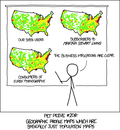
Bad internet maps have been described as a “social media plague”: they’re popular, they’re insidious, and they’re often not even wrong. But they’re not specifically dealt with in How to Lie with Maps, and that’s a blind spot: in the era of fake news, hoaxes and state-sponsored mendacity, maps that go viral are the ones most in need of a vaccination campaign.

Instead, the new chapters focus on image maps (satellite and aerial imagery), prohibitive cartography (which seems out of place here, and seems more a summary of Monmonier’s other work) and “fast maps,” which is more about web-based mapping than the stuff that gets shared on social media. The new chapters are noticeably more concise than the old. The net effect is a book that is still important, still relevant and still badly needed, but whose updates don’t quite bring it up to the present.

I received a review copy from the publisher.

Amazon | iBooks

The Art of Map Illustration

What do we mean by mapmaking? That’s a less straightforward question than it appears at first glance. A cartographer might talk about projections, scale, use of symbols, deciding which information to put on the map; a digital mapmaker might emphasize GIS and data layers and data sources. Your assumptions about what mapmaking is depends largely on the maps your yourself make. And what we mean by “map” can be quite different depending on the context.

The four illustrators who collaborated on The Art of Map Illustration: A Step-by-Step Artistic Exploration of Contemporary Cartography and Mapmaking (Walter Foster, April 2018) use the terms cartography and mapmaking rather differently. These four—James Gulliver Hancock, Hennie Haworth, Stuart Hill and Sarah King—are illustrators first and foremost. Their maps are neither accurate nor detailed; like decorative nautical charts, they’re not for use in navigation, and they say as much at more than one point. But they can also be seen, I think, as the modern-day descendants of the 20th-century pictorial map (about which see Stephen J. Hornsby’s Picturing America, which I reviewed here last November).

Continue reading “The Art of Map Illustration”

Navigation: A Very Short Introduction

The problem with Jim Bennett’s Navigation: A Very Short Introduction (Oxford University Press, May 2017) is summed up in its subtitle: it’s very short, and it’s only an introduction.

Part of Oxford University Press’s Very Short Introductions series, Navigation discusses the tools and methods used by mariners and navigators to find their way across the seas, beginning with various cultures’ ancient navigational techniques, moving through tools like cross-staffs, backstaffs and octants, dealing with the matter of longitude (on which Bennett has some opinions regarding the popular narrative), before wrapping up, too briefly, with modern techologies like radio beacons, inertial navigation and GPS.

There are some illustrations that are a great help in understanding concepts and tools whose use is not immediately obvious, but, as the subtitle suggests, this is not a book that goes into much depth. At only 144 pages—20 percent of which is taken up by front matter, glossary and index—it can only give the barest of introductions to the subject. That can be maddening for the reader, particularly when its coverage is so uneven: there’s a fair bit on the tools and techniques used during the age of sail, but only a paragraph on LORAN and Loran-C, for example. Another frustration is Bennett’s extremely discursive style, as though he were giving a posh invited lecture; I kept feeling that more could have been included had his prose been tightened up.

All the same, there’s value in a book that styles itself, modestly, as an introduction. An introduction is where you begin. It’s the first step, not the finish line. It sets out the parameters of the field and gives you just enough to know what’s out there. For someone like me, it tells me where the gaps are in my knowledge. To paraphrase someone, it lets you know what you do not know. It tells you where to go next: the most useful part of the book may well be its “Further Reading” section; you just need the preceding 116 pages of text to know how to use it.

And for all my concerns about brevity and prose, it’s a good deal more accessible, and easier to read, than the equivalent Wikipedia page—and it went through an editorial process, too. And while it’s not free, it’s very modestly priced. So I have no regrets about buying it.

Amazon | iBooks

The Red Atlas

During the second half of the twentieth century, the Soviet Union’s military and civilian cartographers created topographical maps of the entire world of a very high standard of quality and accuracy. How they did so, and why, remains in large part a mystery, one that John Davies and Alexander J. Kent’s new book, The Red Atlas: How the Soviet Union Secretly Mapped the World (University of Chicago Press, October) fails to solve completely.

The Red Atlas is not the definitive history of those Soviet mapping efforts because so much about those efforts remains a secret. The only reason we know about them is because, in the wake of the collapse of the Soviet Union, so many physical copies of those once-highly secret maps fell into the hands of map collectors. The Red Atlas talks about that: for more than a decade, Davies and Kent have been studying those maps. (I’ve been following their work. See the links at the bottom of this post for my earlier posts on the subject.) What they know about the Soviet mapping efforts—sources, methods, their reason for doing it—is extrapolated from the final product of those effort: the maps. The Red Atlas is above all else an exercise in cartographic forensics.

Continue reading “The Red Atlas”

Picturing America: The Golden Age of Pictorial Maps

With Picturing America: The Golden Age of Pictorial Maps (University of Chicago Press, March 2017), Stephen J. Hornsby makes the case for the pictorial map as a distinct and significant genre of mapmaking that is worthy of study and preservation.

Because pictorial maps were artistic rather than scientific, Hornsby argues, they were ignored as a subject of cartographic study—“treated as ephemera, the flotsam and jetsam of an enormous sea of popular culture.”1 As such they have not been preserved to the same extent as more strictly cartographic maps. (Being printed on cheap acid paper didn’t help.) But as products of popular culture they were distinctive—and ubiquitous. “By World War II,” he writes, “pictorial maps had created a powerful visual image of the United States and were beginning to reimagine the look of the world for a mass consumer audience.”2 They were so prevalent, I suppose, that they were invisible. Taken for granted. It frequently falls to the historian of popular culture to point out that the common and everyday is, in fact, significant. That’s what Hornsby is doing here.

Continue reading “Picturing America: The Golden Age of Pictorial Maps”

You Are Here: NYC: Mapping the Soul of the City

You Are Here NYC: Mapping the Soul of the CityAn exhibition taking place now at the New York City Library, Picturing the City: Illustrated Maps of NYC, features 16 pictorial maps from the Library’s collection of illustrations. Running until 9 April 2018, it’s curated by Katharine Harmon, whose book, You Are Here: NYC: Mapping the Soul of the City, came out last November from Princeton Architectural Press. Here’s an interview with Harmon about the exhibition in Print magazine.

This seems as good an excuse as any to take a closer look at You Are Here: NYC. Past time, actually, since I’ve had a review copy in my hands for a year now.

You Are Here: NYC is the third of Katharine Harmon’s map books. The first, You Are Here: Personal Geographies and Other Maps of the Imagination, came out in 2003, the second, The Map as Art: Contemporary Artists Explore Cartography, in 2010. Harmon’s distinctive style in editing and curating these books, carries over to the present volume.

Continue reading “You Are Here: NYC: Mapping the Soul of the City”

A History of Canada in Ten Maps

The odd thing about A History of Canada in Ten Maps, the new book by Adam Shoalts out today from Allen Lane, is that it’s almost entirely uncontaminated by maps. It’s not just because the electronic review copy I received (via Netgalley) contained no images of the maps being referred to in the text: I expect that will be rectified in the published version; if nothing else I was able to find an online version of each map (a gallery follows below). It’s that in the text itself the maps are quite literally an afterthought.

It turns out that A History of Canada in Ten Maps isn’t really a book about maps, or mapmaking, but exploration. For Shoalts, the maps are the evidentiary traces of the stories he really wants to tell. In nine of the ten cases, those are stories of Canada’s exploration; in the tenth, a key battle of the War of 1812. Combined, those stories form a mosaic tale of nation-building, one that supports the kind of national mythmaking that the previous government in Canada was particularly fond of.

Continue reading “A History of Canada in Ten Maps”

The Territory Is Not the Map

There’s something I’ve noticed about the recent round of debates about fantasy maps, something I’ve been noticing about discussions of fantasy maps in general. They don’t talk about fantasy maps in terms of their cartographic merit. That is to say, they don’t judge fantasy maps as maps.

When Alex Acks vents about fantasy maps, it’s because the mountain ranges in Middle-earth don’t make sense, not because the cartography of Pauline Baynes or Christopher Tolkien wasn’t up to the task. It’s more that the territory is shaped to fit the story rather than the other way around, less that the maps of said territory frequently lack a scale. When Boing Boing’s Rob Beschizza says that “Game of Thrones has such a terrible map it could be presented as a parody of bad fantasy maps,” he’s not saying that the cartography of the various Song of Ice and Fire mapmakers, such as Jonathan Roberts (The Lands of Ice and Fire), James Sinclair (books one through four) or Jeffrey L. Ward (A Dance with Dragons), is deficient. He’s saying that the Game of Thrones geography is terrible.

Continue reading “The Territory Is Not the Map”

Review: Treasures from the Map Room

treasures-map-room-obliqueIf all maps must necessarily be selective, choosing what to show and what to leave out, surely map books must do the same. That thought came to mind as I perused Treasures from the Map Room—no relation—a book that presents maps from Oxford University’s Bodleian Library, collected and curated by the Bodleian Map Room’s senior library assistant, Debbie Hall.

“Although maps have formed part of the Bodleian’s collections from early on, they have been collected actively only since around 1800,” Hall writes in the introduction. Broadly speaking, the Bodleian’s map holdings come from a combination of bequests and legal deposit requirements. The latter in particular means that the Bodleian’s holdings of British maps—including virtually every Ordnance Survey map and a large number of commercially published maps—are very extensive. The bequests are sometimes much better known: maps named for their owners and donors rather than their creators—the Gough Map, the Selden Map—falling into the Bodleian’s hands.

Hall organizes her selection—some 75 maps—into seven chapters organized by theme: Travel and Exploration, Knowledge and Science, Pride and Ownership, Maps of War, The City in Maps, Maps for Fun, and Imaginary Lands. Sometimes those themes make for unlikely juxtapositions: Hall mentions the Tabula Peutingeriana and American highway maps in very nearly the same breath; and Maps for Fun, a chapter dealing with tourism, recreation and travel, includes a 15th-century Holy Land pilgrimage map—Reuwich’s Peregrinatio in Terram Sanctam—alongside the MountMaps 3D Navigator Map. But apart from that the chapters present us with some very interesting maps indeed: Travel and Exploration gives us the Gough and Selden maps; Knowledge and Science discusses Mercator, Ortelius and early astronomical maps, John Speed, Christopher Saxton and the Ordnance Survey; Maps of War gives us fortifications and plans, siege and trench maps, but also silk escape maps of World War II; Imaginary Lands ranges from Hole’s Poly-Olbion maps to Leo Belgicus, Tolkien and Lewis, and the art of Layla Curtis.

We get, in other words, a taste of just about everything—but only a taste. The breadth of Treasures of the Map Room is both a blessing and a curse. We’re made aware of the volume and diversity of the Bodleian’s map holdings, but we never get a chance to drill down beyond the most cursory of examinations, never more than one example of something. On the other hand, Hall’s approach brings to the fore maps that might not otherwise be included in books like this—books that can privilege the rare and the ancient over the more mundane but more significant. For example, the map I found myself staring at the most was the 1864 Ordnance Plan of the Crystal Palace and its Environs, a 1:2,500 map of incredible detail and delicacy. You might find yourself lingering over some other map. Discoveries like this are, I suspect, the whole point of book that is, after all, about a library’s hidden treasures.

I received a review copy from the North American distributor for this book, the University of Chicago Press.

Treasures of the Map Room edited by Debbie Hall (Oxford: Bodleian Library, 2016). Hardcover, 224 pp., £35/$60. ISBN 978-1-85124-2504. Buy at Amazon.

Previously: Treasures from the Map Room.

Atlas Obscura

atlas-obscura-obliqueAtlas Obscura, the website, has been aggregating an online database of unusual and interesting places around the world for the past several years. Atlas Obscura, the company, has been expanding at a rapid pace these past few years, hiring former Slate editor David Plotz as their CEO in 2014. One result of said expansion has now come to fruition in the form of Atlas Obscura, the book, out this week from Workman Publishing. Written by co-founders Joshua Foer and Dylan Thuras and associate editor Ella Morton, Atlas Obscura is basically a curated subset of the online Atlas Obscura experience.

Like the Atlas of Cursed Places (reviewed here), Atlas Obscura is not an atlas per se. There are maps, but they exist to locate the subjects of the essays that make up this book. Those subjects—those weird and wonderful places—also appear on the website, but the essays are different; in the sample I compared, the book’s version is considerably briefer and more dense. This is to be expected: when you have fewer than 500 pages to work with, you have to make some zero-sum editorial decisions. Fewer, more fulsome pieces, or more pieces of shorter length. Atlas Obscura has opted for the latter, with pieces that are frustratingly, tantalizingly brief, each followed by a little information on how to get there (or, in some cases, whether you can get there). Even then only a fraction of the places that appear online appear between the book’s covers.

But browsing a website is not the same experience as reading a book. No one would try to go through the entire Atlas Obscura database; the book allows for a big-picture look at the sort of thing found there. A curated subset, as I said above. A taster’s menu. The book also rewards serendipity and pleasant surprises: whether you’re reading from beginning to end (as I did for this review), looking for specific continents, regions or countries, or flipping through pages at random, you’re bound to encounter an entry you hadn’t expected to come across. If there’s value in a hard-copy (or electronic: Kindle, iBooks) version of something freely available online in expanded form, it’s here. And let me be clear: that’s not nothing.

I received an electronic advance review copy from the publisher via NetGalley.

Buy Atlas Obscura via Amazon or iBooks.

Related: Map Books of 2016.

China at the Center

Two important seventeenth-century world maps are the focus of a new exhibition opening this Friday at the Asian Art Museum in San Francisco. China at the Center: Rare Ricci and Verbiest World Maps, which runs from 4 March to 8 May 2016, features Matteo Ricci’s 1602 map and Ferdinand Verbiest’s 1674 map.

Ricci (1552–1610) and Verbiest (1623–1688) were both Jesuit priests, in China to spread Christianity; their maps, produced in collaboration with Chinese calligraphers, artists and printers, produced a fundamental rethinking of China’s place in the world. Not that China wasn’t at the centre of these maps, as the essays in the accompanying catalogue point out, but these maps filled out the rest of the world, which was previously a marginal afterthought in Chinese cartography.

Continue reading “China at the Center”