Historical Highway Maps of Manitoba

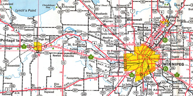
Detail from the 1966-1967 Official Highway Map of Manitoba

While looking for something else, I stumbled across the Manitoba Infrastructure and Transportation Ministry’s Historical Highway Maps of Manitoba site: a collection of PDF scans of dozens of highway maps of the province. The earliest is a 1926 map produced by the Winnipeg Tourist and Convention Bureau; the most recent is the B version of the 2010 Official Highway Map. Collectively they trace the development of the province’s road network: I got so very lost in this site watching the road network change from year to year—just as I did as a child, when I studied each new edition to see what had changed from the previous year. This is a weapons-grade hit of nostalgia for me.

Above, a detail from the 1966-1967 map, the first to use the style of map that I was familar with growing up in the 1970s.

Previously: Manitoba Historical Maps.

Google Maps Edits Cause Embarrassment

Some embarrassment for Google Maps last week, as they were forced to apologize for an image of the Android mascot peeing on an Apple logo that turned up on the map near Rawalpindi in Pakistan. To say nothing of the phrase “Google review policy is crap” etched into nearby Takht Pari Forest. Both have since been removed. Boing Boing, the Guardian, The Verge.

To be fair to Google, crowdsourcing map data does have its pitfalls: OpenStreetMap has to deal with this sort of thing all the time. You have to have something in place to deal with bad-faith edits. None of the edits I’ve made to Google Maps went through without someone reviewing them, so I’m surprised that this could happen. That said, when you need your map updated fast (such as during natural disasters like yesterday’s earthquake in Nepal), it’s hard to beat crowdsourcing.

As always, it’s important to keep in mind that all online maps have their shortcomings.

Map of Canada Changes Depiction of Arctic Sea Ice

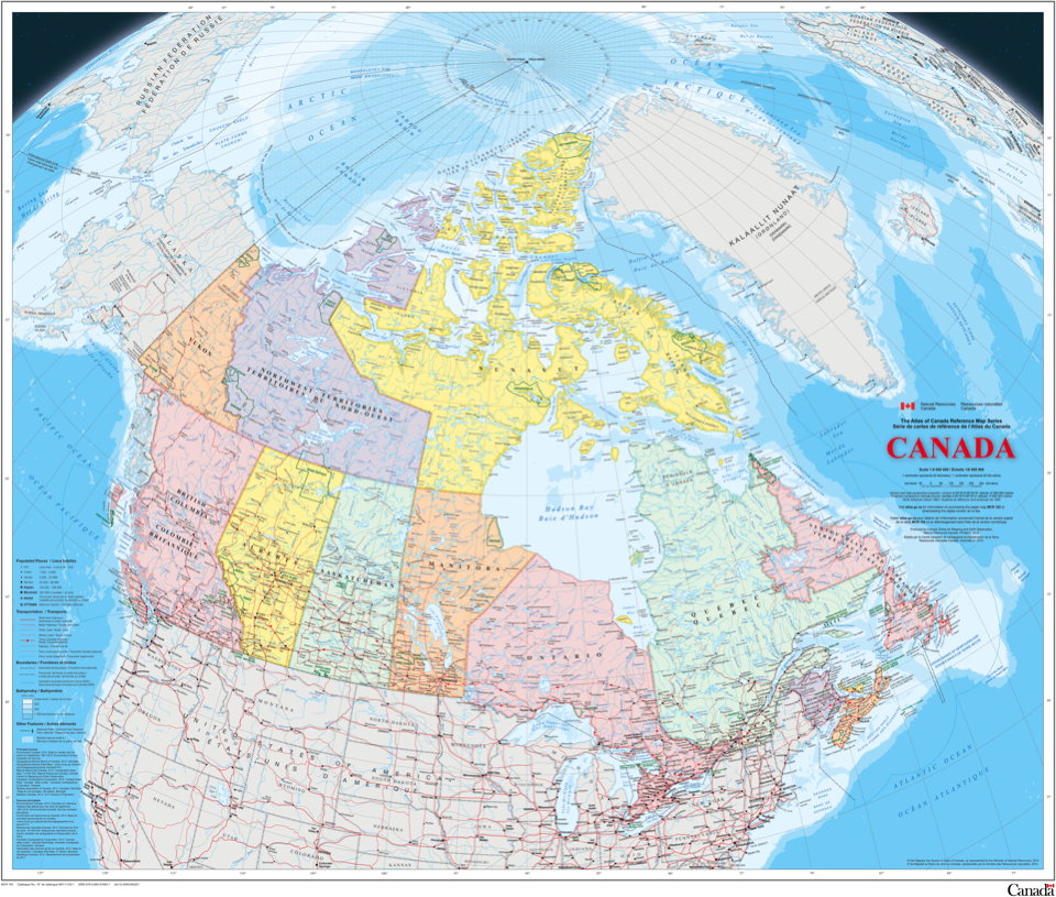
Map of Canada

The federal government’s new map of Canada, part of the Atlas of Canada reference series, came out this week. Among the changes between it and its predecessor (which came out in 2006), one in particular is drawing attention. Ivan Semeniuk in the Globe and Mail:

Whereas the older version of the map showed only that part of the sea ice that permanently covered Arctic waters year round at that time, the new edition uses a 30-year median of September sea-ice extent from 1981 through 2010. September sea ice hit a record low in 2012 and is projected to decline further. The change means there is far more ice shown on the 2015 version of the map than on its predecessor.

The changes can be seen below: the 2006 map is on the left, the 2015 map on the right.

Differences in sea ice between 2006 and 2015 maps of Canada

Now as Semeniuk’s piece points out, neither way is wrong. But all maps have a point of view, and it’s naive to think that this change was made in a value-neutral environment: this was the result of a conscious decision. The reason for that decision—that’s what’s interesting.

Space Maps: Ceres, Mars, Exoplanets

Mars: Ares Vallis