My New Article on Fantasy Maps: ‘Here Be Blank Spaces’

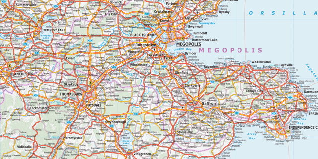
NYRSF logo My short essay on fantasy maps, “Here Be Blank Spaces: Vaguely Medieval Fantasy Maps” appears in issue #300 of The New York Review of Science Fiction, out today. I wrote it in response to several books I read rather closely together earlier this year: Reinhart’s Art of the Map, Van Duzer’s Sea Monsters on Medieval and Renaissance Maps, and especially Ekman’s Here Be Dragons (links to my reviews). Taken together, these books highlighted a key difference between fantasy maps and their real-world counterparts from medieval and early modern Europe: fantasy maps are full of blank spaces; real-world maps were not.

Issue #300 of the NYRSF should be available to subscribers now. If you’re not a subscriber, you’re in luck: issue #300 is being made available for free (it’s the NYRSF‘s 25th anniversary, and the publishers are offering it to celebrate and in hopes that you’ll subscribe). Download it from this page. I’ll eventually have it up in the Articles section as well.

Update 8/28: Read the article here.

Ian Silva’s Koana Islands

Koana Islands (Ian Silva)

Wired Map Lab has the story of Ian Silva, who’s been posting astonishing road and transit maps of the imaginary Koana Islands to Reddit; the Islands now have their own section on the site, replete with a travel guide. It’s as serious an undertaking as William Sarjeant’s Rockall, Jerry Gretzinger’s Ukrainia, or Austin Tappan Wright’s Islandia.

I admit it: I love geofiction—creating imaginary worlds through maps—and I always get excited when I encounter a great new mapmaker. This is no exception.

The World on an Egg, circa 1504

In an article published this week in the Washington Map Society’s journal, The Portolan, map collector Stefaan Missinne has announced the discovery of a small, engraved globe that he says is the first to depict the New World. From the WMS’s press release:

The previously-unknown globe, which is about the size of a grapefruit, was made from the lower halves of two ostrich eggs, and dates from the very early 1500s. Until now, it was thought that the oldest globe to show the New World was the “Lenox Globe” at the New York Public Library, but the author presents evidence that this Renaissance ostrich egg globe was actually used to cast the copper Lenox globe, putting its date c. 1504. The globe reflects the knowledge gleaned by Christopher Columbus and other very early European explorers including Amerigo Vespucci after whom America was named.

Ostrich egg globe
The Portolan (Washington Map Society)

The Lenox Globe—also known as the Hunt-Lenox Globe—was cast in 1510; interestingly, prior to this announcement, it was the only map or globe to contain the phrase hic sunt draconeshere be dragons. This globe has the phrase as well. In the Washington Post coverage, two map experts—John Hessler and Chet Van Duzer—are quoted expressing a certain amount of skepticism (especially about the purported da Vinci connection). I also suspect caution is warranted here: the history of antique maps contains several examples of groundshaking discoveries that turn out to be dubious at best.

Tube Map Live

Tube Map Live icon Andy Drizen’s Tube Map Live (iTunes), a free iOS app (native iPhone and iPad versions) that shows the real-time positions of London Underground trains on the iconic Tube map, using official data. Hypnotic visualization, but the app essentially promotes Drizen’s £1.99/$2.99 Tube Tracker: tapping on trains or stations calls up an advertising popup. Via TUAW.

Pluto’s Problematic Cartography

We’re still two years from the New Horizons flyby of Pluto, but the cartography of the solar system’s most famous dwarf planet—based on Hubble imagery—is already several kinds of problematic, as Emily Lakdawalla explains in a post that also explains how the cartography of other worlds is done. (Key challenges include defining the north and south pole—which one is which?—as well as a prime meridian.)

A Fantasy Map of Ireland

Fantasy map of Ireland Another data point for our consideration of what people think a fantasy map looks like, from the author of the Maptitude tumblelog: a fantasy map of Ireland, replete with, as you would expect, forests and hills. It departs from the fantasy map paradigm by using colour: red for political boundaries, blue for water. It also uses a vaguely uncial script: something we’ve seen in the movie versions of The Lord of the Rings, but less often in fantasy book maps. Not inappropriate for Ireland, though.

Previously: A Fantasy Map of Great Britain; A Fantasy Map of Australia; A Fantasy Map of the U.S.

Wired Map Lab

Two years ago, after I brought The Map Room to a close, despondent readers asked me where they could go for their map fix, now that I was denying it to them. At the time I couldn’t point to a map blog that covered maps in general, rather than a specific niche (e.g., online maps but not antique maps). Last month, though, saw the launch of Wired Map Lab, a member of the evil empire of Wired‘s science blogs. Looks like it’s off to an ambitious start.

Close Up at a Distance

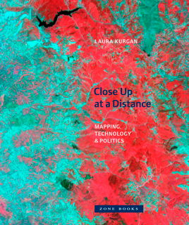
Book cover: Close Up at a Distance Briefly noted: Laura Kurgan’s Close Up at a Distance: Mapping, Technology, and Politics (Zone Books, March 2013), a different look at maps built with satellite imagery, GIS and GPS data. “Poised at the intersection of art, architecture, activism, and geography, her analysis uncovers the implicit biases of the new views, the means of recording information they present, and the new spaces they have opened up. Her presentation of these maps reclaims, repurposes, and discovers new and even inadvertent uses for them, including documentary, memorial, preservation, interpretation, political, or simply aesthetic.” Via Human Scale Cities.