Algonquin Bead Artist to Reinterpret Cold War Maps

The Diefenbunker is a Cold War-era fallout shelter on the outskirts of Ottawa that has since been converted into a museum. Its large floor maps, never used or displayed, are serving as grist for an Indigenous artist in residence, CBC Ottawa reports:

As the new artist in residence at Ottawa’s Diefenbunker Museum, Mairi Brascoupé is blending Cold War-era maps and beadwork to explore the idea of “place” during times of change.

Brascoupé, a member of Kitigan Zibi Anishinabeg First Nation, wants to weave her own story by exploring the differences between cultures of Indigenous people and settlers.

She plans to use waterways and traplines in contrast with fallout zones, evacuation plans, and other details of the museum’s maps.

A Network Map of Ottawa’s Cycling Network

Hans on the Bike map of the Ottawa-Gatineau cycling network
Hans on the Bike

Hans on the Bike has produced a map of the Ottawa-Gatineau bicycle path network in the style of a Beck-style subway network map. “Is a metro map for cycling useful? I think it has a function in visualizing a network in an easy and pleasing way,” he writes. “In the end it is more a fun project than a bike map avant la lettre.”

Nothing wrong with it as a fun exercise, but can it actually be used? As someone who back in the day biked quite a lot of the Ottawa and Gatineau bike trail network, I can’t use this map. I don’t recognize the path network. Part of it is because many of those paths have names that he doesn’t use; part of it is the conceit of creating “stations”; part of it is that a surface path network that can be entered or exited at any point is not well served by a network diagram. It makes sense to abstract a subway network from the street level, because you’re basically travelling from station to station. You’re not doing that on a bike; you’re in the neighbourhood.

COVID-19 in Ottawa Neighbourhoods

Ottawa Public Health has partnered with the Ottawa Neighbourhood Study to produce this interactive map of COVID-19 rates in Ottawa’s neighbourhoods. Both the map and its underlying data are subject to many caveats: the differences between rural and urban zones, between where people live and where people are tested, and other factors affecting testing and susceptibility. Most notably, the map is updated only monthly, so the current map (screenshotted above) does not take into account the rapid increase in positive cases over the past week or two as Ottawa entered the second wave. [Ottawa Citizen]

Mapping Ottawa’s LRT

OC Transpo

Ottawa’s new light rail line opened to the public last month, more than a year overdue, and this week the bus routes change to account for that fact. The new system network map (downtown inset above) strongly resembles the map released last year, which showed what the bus routes would have been had the LRT opened back then, somewhat less late, but there are some subtle changes here and there.

Meanwhile, planning is under way for the next stage of LRT construction. The City of Ottawa has an interactive map showing where the new (and existing) lines will be going: it’s a track network map that shows every crossover and platform, and goes a long way toward satisfying my curiosity.

Using Street View to Spot Gentrification

CBC News: “A group of researchers at the University of Ottawa is using Google Street View to spot instances of gentrification in the city’s neighbourhoods. […] The program looks for patterns of improvements on individual properties, such as new fences, landscaping, siding or significant renovations.” Honestly not something for which I expected Street View to have a use.

New Ottawa Transit Map Goes Diagrammatic

OC Transpo

Last week OC Transpo, the City of Ottawa’s transit service, unveiled a new network map (PDF) that shows the transit routes that will be in effect after the new LRT opens, which is (at the moment) scheduled to take place in November. From a cartographic perspective, what’s interesting is that OC Transpo’s new map adopts a diagrammatic, non-geographical design after years of their maps simply overlaying transit lines over a city map (see, for example, the latest, pre-LRT transit map, PDF). The approach allows the map to enlarge the more densely served core and inner suburbs and shrink the larger, but less service-dense outer suburbs—which is exactly what diagrammatic transit maps of sprawling cities are good for.

Gatineau Park Recommends Paper Maps

Gatineau Park (National Capital Commission)

Relying on your smartphone’s maps can be risky in places where cellular service is patchy. That goes for Gatineau Park, where, despite the fact that its southeast corner is surrounded by the city of Gatineau, Quebec (across the river from Ottawa), staff still recommend people use paper maps, CBC News reports. It’s a big park, after all, and not all of it is in the city. But it’s not just about dead zones and dead batteries: out of date trail information and lack of trail difficulty are also problems. None of these problems, mind you, are unfixable (except, you know, dead batteries).

The paper maps in question include general summer and winter maps, along with trail maps for summer and winter activities (all links to PDF files). They’re not total luddites: here’s an interactive map.

Ottawa City Councillor Wants a Map of Road Conditions Like Los Angeles’s

An Ottawa city councillor wants take a page out of Los Angeles’s playbook and create a real-time interactive map of the city’s road conditions. L.A.’s street assessment map rates road conditions as good, fair or poor. Since Ottawa’s roads are on balance between fair and poor, it might be revealing, if uncomfortable, to have all that road data easily accessible; at the moment it can only be accessed by asking city officials about the state of a given street.

CCA Annual Conference in Ottawa

The Canadian Cartographic Association’s annual conference gets under way tomorrow at Carleton University in Ottawa. Here’s the conference program. It’s just an hour’s drive from where I live, and by all rights I should be attending, but I’ve been moving house all month and there’s no way I can spare the time. Best wishes to the conference organizers and attendees.

Ottawa and Gatineau’s Growing Suburbs

Meanwhile, the Ottawa-Gatineau urban agglomeration (which is, as urban areas go, the closest to where I currently live) has, according to the census, grown by 5.5 percent since 2011, to a total population of 1.3 million. Much of that growth has occurred in suburbs that barely existed even when I moved to the region in 1999. This CBC Ottawa feature uses the Google Earth engine’s timelapse video function to chart the growth of seven of those suburbs. (Above: the Gatineau suburb of Aylmer.)

OpenStreetMap in Ottawa

I nearly forgot to mention that last Sunday I gave a presentation on the state of OpenStreetMap in Ottawa to the SummerCamp 2011 Mapping Party. It was a small group — five of us, the majority of whom knew more about the subject than I did — and, due to technical snafus with the meeting location, was held in a Bridgehead coffee shop on Bank Street. All the same, my spiel was well received. I made three points in the presentation: that OpenStreetMap was a lot less complete than some make it out to be; that the OSM map of Ottawa needs a lot of work; and here’s what to do about it.

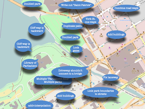
I suppose that I could make the slideshow available if you’re really interested, but my presentations tend to be talks illustrated by slides, rather than read-the-slides, so without me talking it through it’d be kind of confusing. But here’s the penultimate slide, which shows a screencap of OSM’s map of downtown Ottawa, with things that need fixing helpfully labelled.

Ottawa Mapping Party Presentation

You’ll be happy to know that many of these things have since been fixed.