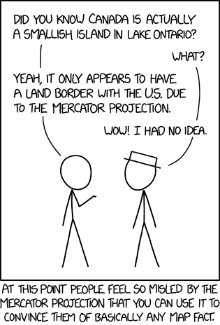
Saturday Morning Breakfast Cereal’s take on the Mercator projection is … not what you’d expect. The punch line is similar to Christopher Rowe’s short story, “Another Word for Map Is Faith”: if you can’t make the map conform to the territory, make the territory conform to the map. Since we’re dealing with the Mercator projection, this requires some … escalation.
Randall Munroe, “Bad Map Projection: South America.” xkcd, 17 Jan 2020.
xkcd is back with another bad map projection: in this one, it’s all South Americas. The alt-text: “The projection does a good job preserving both distance and azimuth, at the cost of really exaggerating how many South Americas there are.”
If you’re not familiar with that poem, here’s the key passage:
He had bought a large map representing the sea, Without the least vestige of land:
And the crew were much pleased when they found it to be A map they could all understand.
“What’s the good of Mercator’s North Poles and Equators, Tropics, Zones, and Meridian Lines?”
So the Bellman would cry and the crew would reply “They are merely conventional signs!
“Other maps are such shapes, with their islands and capes! But we’ve got our brave Captain to thank:”
(So the crew would protest) “that he’s bought us the best— A perfect and absolute blank!”
It’s not like xkcd has a monopoly on comics about maps. Last week, Zach Weinersmith’s Saturday Morning Breakfast Cereal web comic posted a comic about alternative non-spherical Earth theories: everything from a hollow Earth to, well, stranger variations—including a slightly lumpy oblate spheroid Earth, which I frankly find hard to believe in.
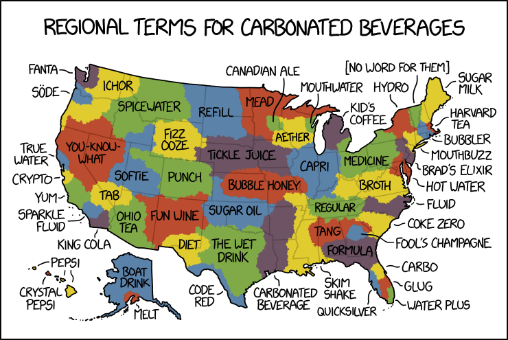
By law, I am required to share every xkcd comic about maps. Today’s makes great fun of pop versus soda maps—the maps showing where in the U.S. carbonated beverages are referred to as pop versus where they’re referred to as soda. Randall takes things to their ludicrous extremes, as he is, by law, required to do.
The web comic xkcd has done maps before (and I’ve covered most of them) but Friday’s iteration was a departure all the same: an interactive map of the challengers in the 2018 U.S. midterm elections: the larger the candidate’s name, the more significant the office and the better their odds of winning. Remember, these are only the challengers: no incumbents are listed.
The latest cartoon from Itchy Feet, a comic about travel and language by filmmaker Malachi Rempen, is a “Map of Every European City.” In the comments, the cartoonist says, “Having been to every single European city, I can safely say with confidence that they all look exactly like this.” I don’t think he’s wrong.
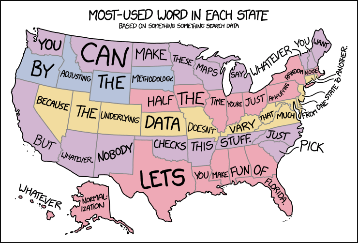
In yesterday’s xkcd cartoon, Randall makes explicit what I think a lot of us have been thinking about those maps assigning a word or a search term to each state or country or whatnot.
Randall Munroe, “Bad Map Projection: Time Zones,” 15 February 2017. xkcd.
Randall Munroe is a bad man who is back with another bad map projection to make our eyes bleed. (If he does this often enough he’ll have enough for a book. Heaven forfend.) This one is, like his other maps, fiendishly subtle: it stretches and compresses countries to fit where their time zones ought to be, longitudinally speaking.