
How this map isn’t nothing but Columbuses and Springfields, I have no idea.

How this map isn’t nothing but Columbuses and Springfields, I have no idea.

xkcd did another map thing, so I have to post about it; it’s a rule. This time Randall revisits the design of the map he did for the 2016 U.S. presidential election, in which one figure represents 250,000 votes for each candidate. In a Twitter thread, he explains the rationale for the map:
It tries to address something that I find frustrating about election maps: Very few of them do a good job of showing where voters are. […] There are more Trump voters in California than Texas, more Biden voters in Texas than New York, more Trump voters in New York than Ohio, more Biden voters in Ohio than Massachusetts, more Trump voters in Massachusetts than Mississippi, and more Biden voters in Mississippi than Vermont.
Previously: xkcd’s 2016 Election Map.

The thing about this xkcd cartoon is that at first glance it’s entirely plausible: Randall has done violence to state boundaries while maintaining the rough overall shape of the lower 48. He’s snipped out seven states without anyone noticing if they don’t look too closely.
Previously: xkcd’s United States Map; ‘They Just Wanted to Fix Some Things About the State Borders’.
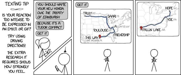
The latest xkcd comic suggests a fiendish way to express yourself: by creating phrases from driving direction waypoints.
An obvious upgrade would be to use one or more of the places from the Magnificently Rude Map of World Place Names (previously).

xkcd is back with another bad map projection: in this one, it’s all South Americas. The alt-text: “The projection does a good job preserving both distance and azimuth, at the cost of really exaggerating how many South Americas there are.”
Previously: xkcd’s Time Zone Map; xkcd’s Liquid Resize Map Projection; xkcd’s United States Map.
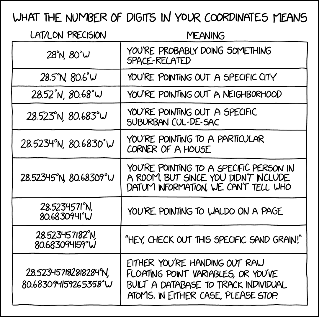
In Monday’s xckd, Randall Munroe points out that when it comes to coordinate precision, there is such a thing as too many decimal places.
Oh look, another map-themed comic/infographic thingy from xkcd: the March 20 edition is having some fun with the maps generated by Google Trends data. The maps are real, says Randall.
By law, I am required to share every xkcd comic about maps. Today’s makes great fun of pop versus soda maps—the maps showing where in the U.S. carbonated beverages are referred to as pop versus where they’re referred to as soda. Randall takes things to their ludicrous extremes, as he is, by law, required to do.
Last Friday’s xkcd suggests that the Mercator projection’s reputation can be used to convince anyone of any false geographical fact.
Not that I’d suggest you do that, mind. No.
The web comic xkcd has done maps before (and I’ve covered most of them) but Friday’s iteration was a departure all the same: an interactive map of the challengers in the 2018 U.S. midterm elections: the larger the candidate’s name, the more significant the office and the better their odds of winning. Remember, these are only the challengers: no incumbents are listed.
Hey look, GIS people: Randall Munroe made an xkcd comic just for you.

The maps that appear from time to time on xkcd are usually a lot more whimsical than the one Randall posted today: his somewhat belated “2016 Election Map” assigns one figure for every 250,000 votes for each of the 2016 presidential election candidates. As Randall says in the alt text,1 “I like the idea of cartograms (distorted population maps), but I feel like in practice they often end up being the worst of both worlds—not great for showing geography OR counting people. And on top of that, they have all the problems of a chloro… chorophl… chloropet… map with areas colored in.” This is an issue that election map cartographers regularly have to deal with, as many of my readers know well.
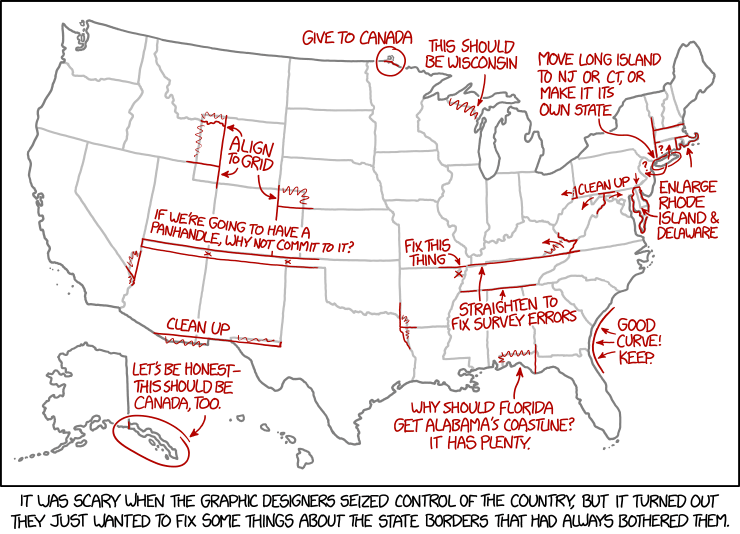
Today’s xkcd. Apparently, the graphic-designer dictatorship will, in their zeal to fix the state borders, overlook Point Roberts.
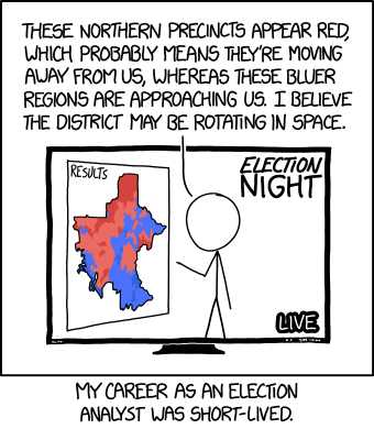
I’m surprised it took as look as it did for physics and cartography to collide—relativity and choropleth maps—in an xkcd cartoon.
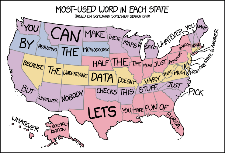
In yesterday’s xkcd cartoon, Randall makes explicit what I think a lot of us have been thinking about those maps assigning a word or a search term to each state or country or whatnot.